Edenspiekermann
Automotive infotainment HMI UX concept for the Aurora Zoom Apex, a high-end electric SUV
Estimated reading time: 10-11 minutes
Project duration: 2.5 months
Project Overview
Date
Oct 2023 - Dec 2023
Team
Paul Woods - CEO of Edenspiekermann
Jens Rauenbusch - UX Designer at Edenspiekermann
Rishma Balakrishnan - UX Designer
My role
Competitive research, UI/UX design
Edenspiekermann, a global creative agency, tasked me with designing the infotainment UX for the Aurora, a fictional EV startup with a vision of bringing a volume SUV to the market. Its banner offering, the Zoom, is an electric SUV like no other. I designed the infotainment for the premium configuration of the Zoom, called the Apex. I specifically developed the information architecture for a multi-screen experience that allows for a premium driving experience.
Problem Statement
The Apex needs to provide drivers with the innovative technology that they expect from electric SUVs while ensuring that they can quickly and safely access their most-used features at any time. It also needs to distribute information properly between the in-vehicle screens and the heads-up display to avoid information overload.
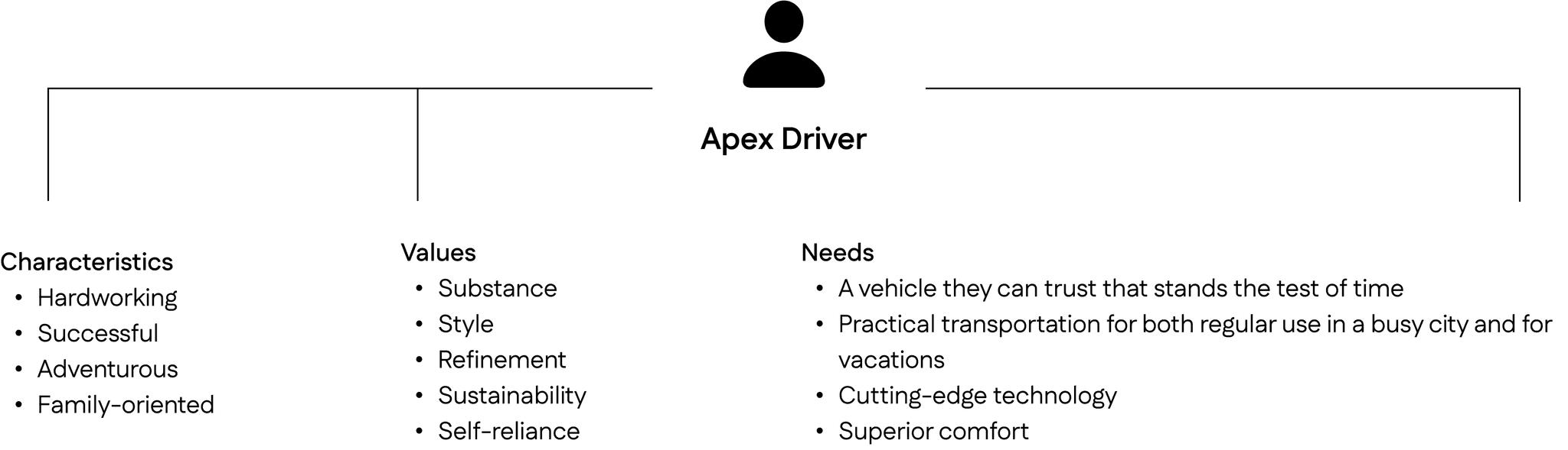
Persona
Benchmarking
To benchmark industry standards for existing electric SUVs, I chose to analyze vehicles that had a similar number of screens as the Apex and made great use of the space for their infotainment system and those that had really great vehicle visualizations in their interface.
Here are my main takeaways from this process:
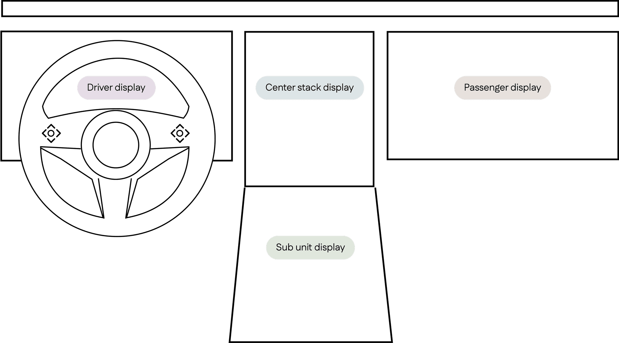
The driver display shows drivers the most pertinent information they need while driving, like their speed and range
The center stack display contains the bulk of the vehicle’s capabilities, from navigation to media controls
The sub unit display typically only includes vehicle controls like lights, doors, windows, etc.
The passenger display is mostly used for entertainment
Cadillac Escalade IQ 2025
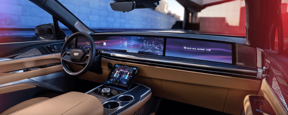
This particular vehicle also has a driver display, center stack display, sub unit display, and a passenger display. I knew that designing for the Apex would be a challenge due to the vast number of screens, so I was really interested to see how Cadillac split up the information architecture between the different screens.
I was particularly interested in the information that was relegated to the sub unit display and the passenger display since I was already relatively familiar with the information architecture of a driver display (gauges, warning indicators, select multimedia information) and the center stack display (more multimedia information, select vehicle controls, navigation, and settings).
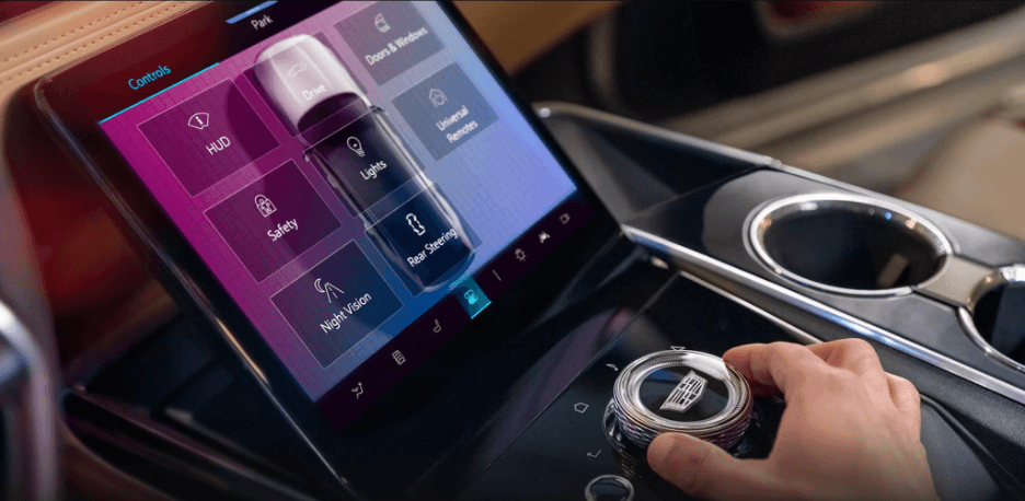
The sub unit display is mainly used for vehicle controls.
The passenger display is mainly used for entertainment.
Lucid Air 2024
Similarly, the Lucid Air’s vehicle controls are also located in its sub unit display.
These vehicle controls include:
Drive mode
Mirror adjustments
Security and locks
Climate control
Kia EV6 2022
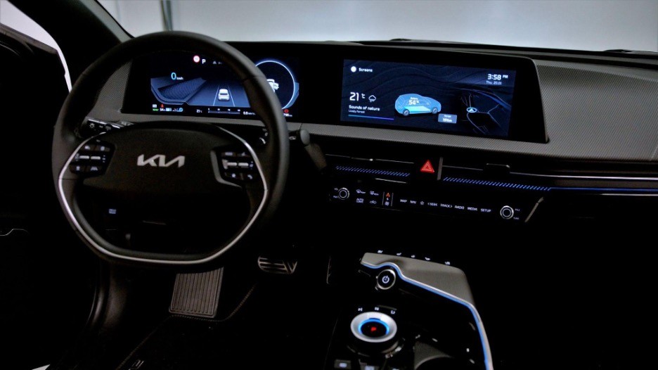
I was also interested in maximizing the space available on the large displays of the Apex, so I looked at the Kia EV6, which has a great vehicle exterior tracing visual on the center stack display to show drivers their battery status.
Information Architecture
I began to group all of the different features that would need to be present in the infotainment system by doing a card sort. I played around with different groupings and landed on this one:
Of these four categories, I then had to decide which categories would be placed on which of the vehicle’s screens.
Driver display
I decided to put vehicle control indicators in the driver display where most drivers would expect to find them (e.g. turn signal indicators). I also wanted to add the next turn-by-turn direction from the navigation into the driver display so that drivers could glance at this display to see when and where their next turn is. Similarly, I also decided to include a quick snapshot of the media and entertainment in the driver display so that drivers can quickly check what is playing without needing to look away from the driver display.
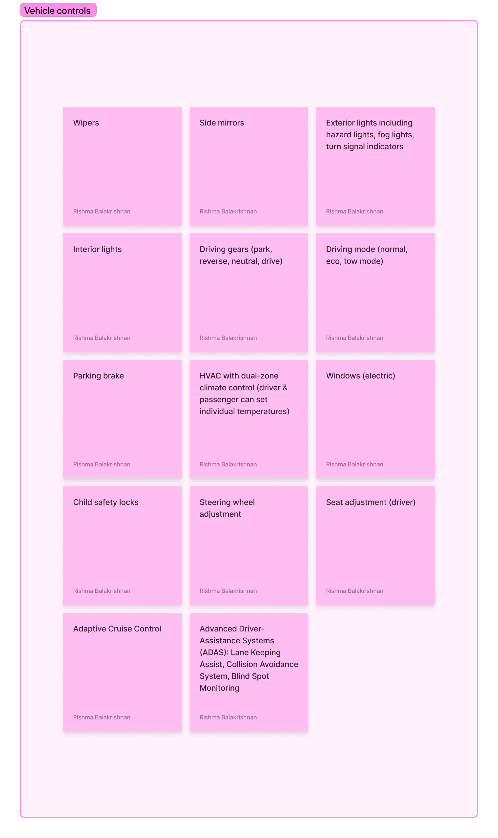
Sub unit display
Though I decided to put the vehicle control indicators in the driver display, I put the actual vehicle controls in the sub unit display because of one of the benchmarks I uncovered in my competitive research: if a vehicle has a sub unit display, vehicle controls are typically placed there so that the driver can easily reach them while driving.
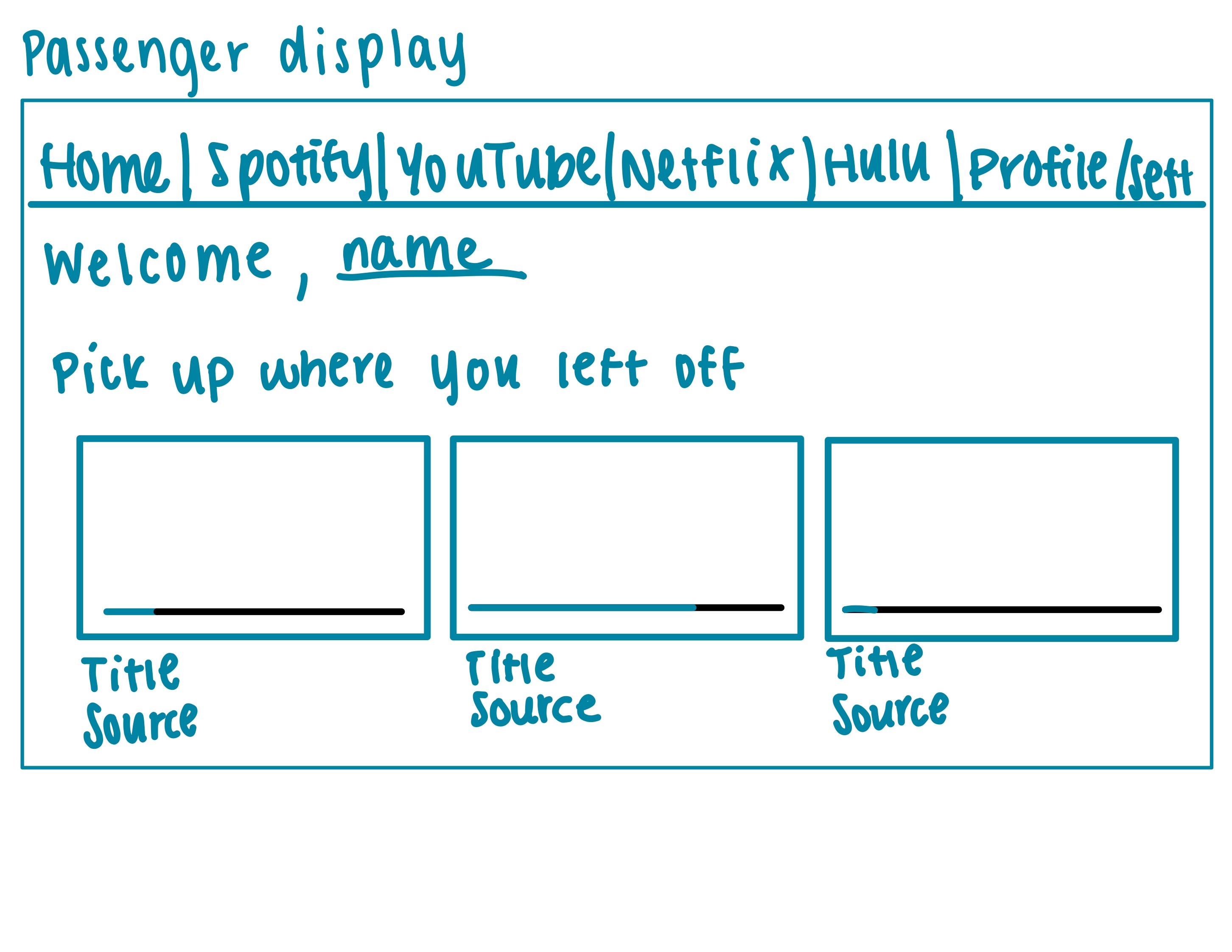
Passenger display
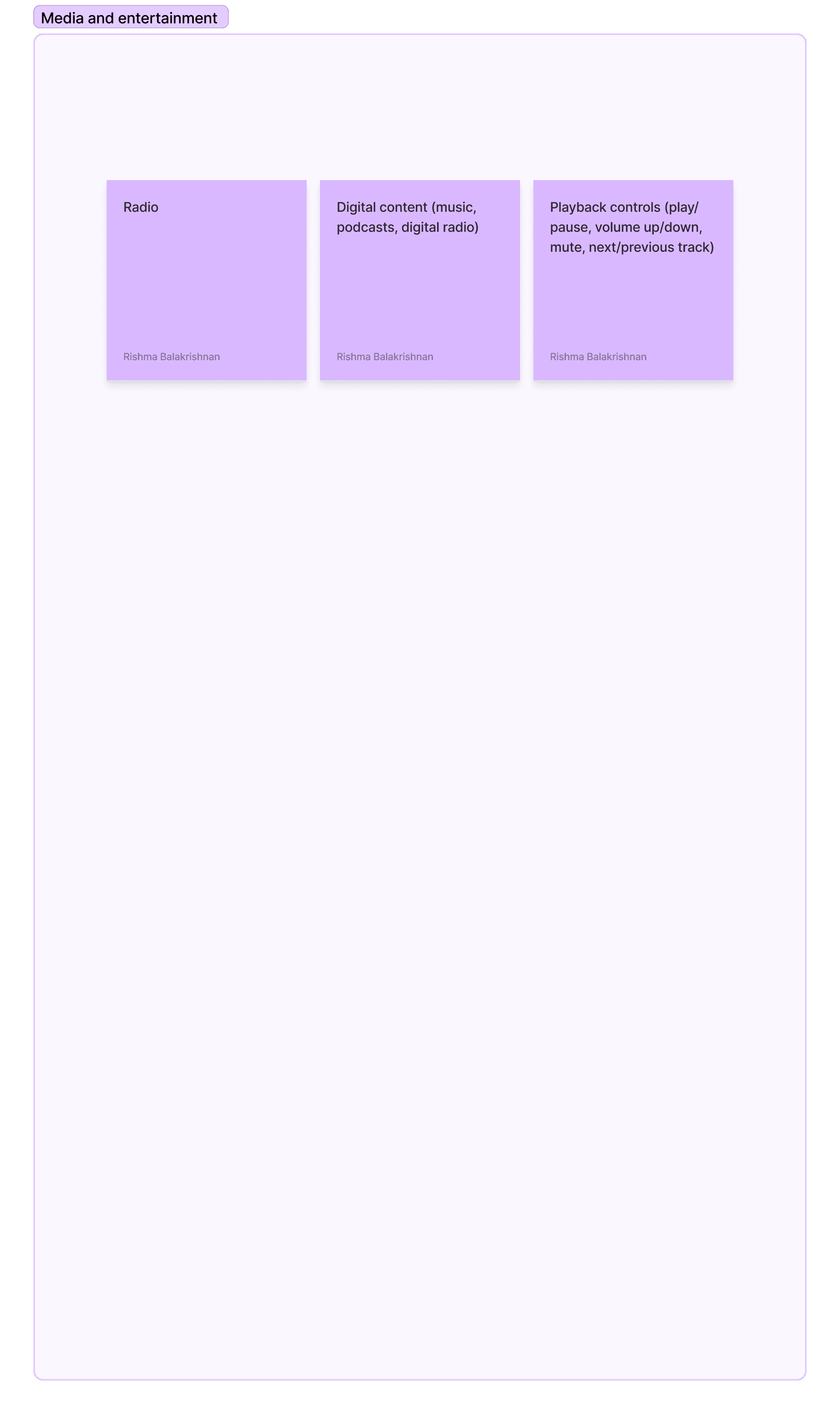
Since this screen is only visible to the passenger, I decided to include all entertainment options here, including video streaming services. Regulations prevent drivers from accessing videos while driving, so placing this in the passenger display makes the most sense. It is also where other vehicles from my benchmarking above have placed all their entertainment options.
Center stack display
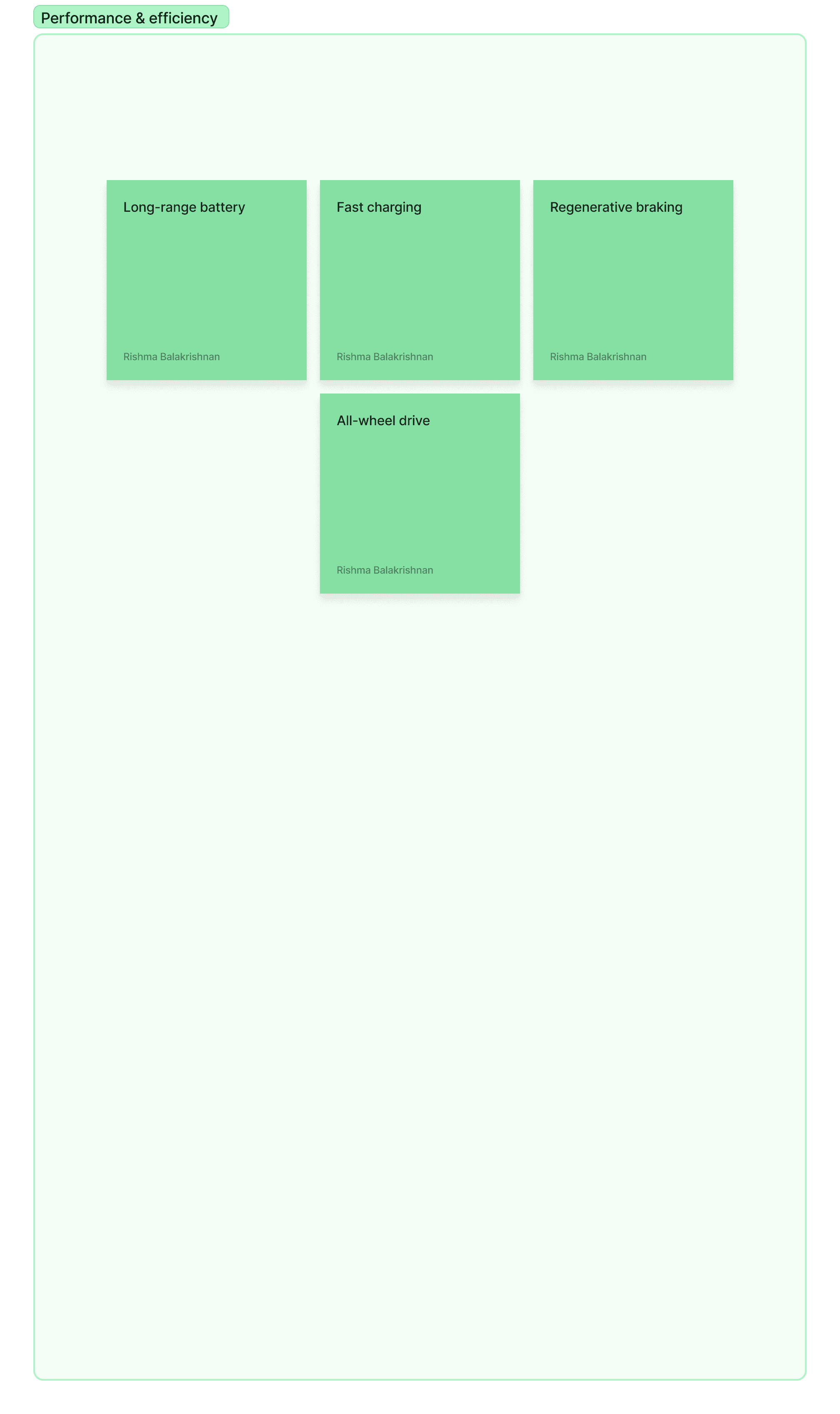
Since this is the central screen within the vehicle, I wanted to make sure that most of the information and actions available to the driver and front passenger can be accessed from this screen, so I included media and entertainment controls, navigation, and performance/efficiency information here.
Sketches
I began sketching out the different screens so that I could decide where exactly I wanted different controls to go, and then received feedback from UX designers from Edenspiekermann to finalize the information architecture and refine the visual design in my mid-fidelity wireframes.
1
Driver display
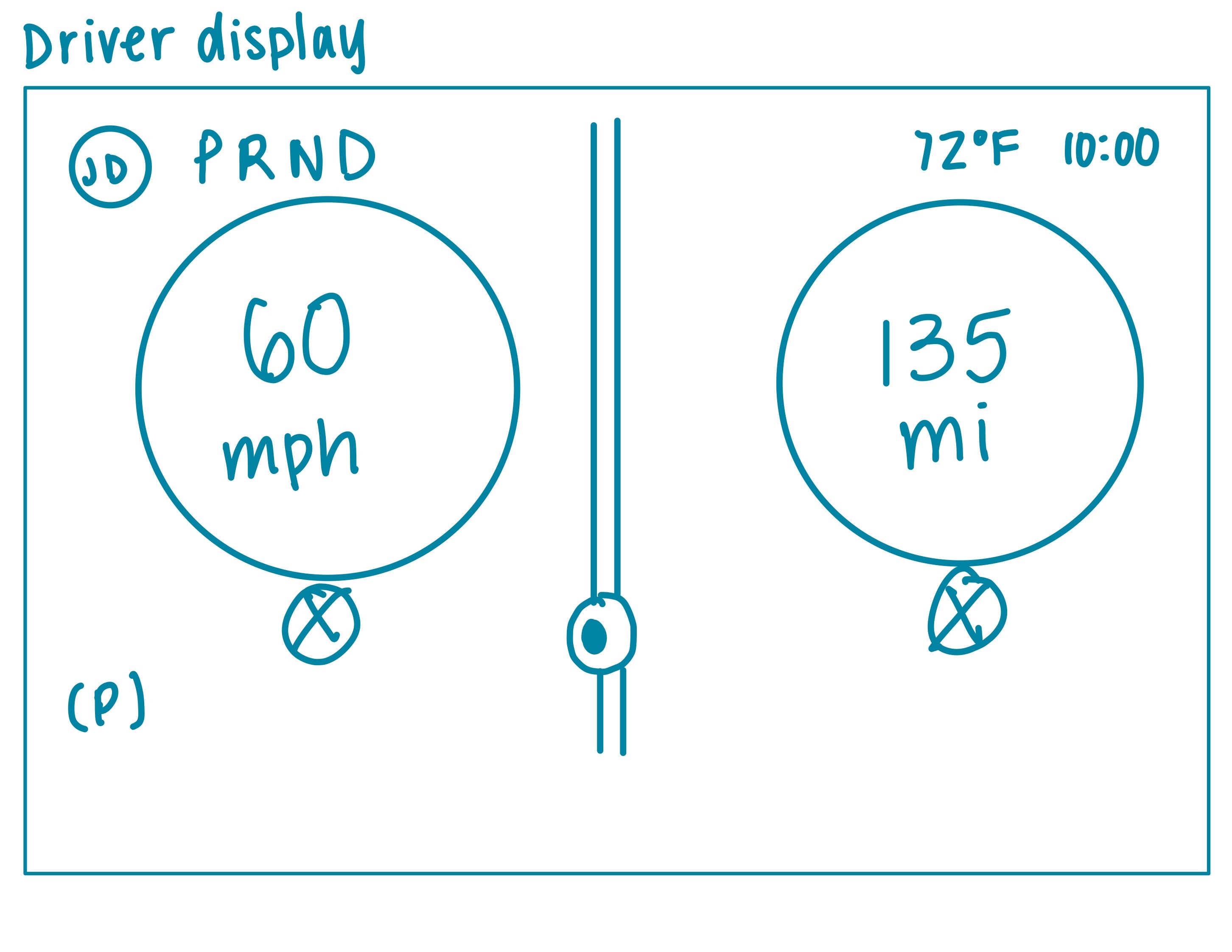
I knew that it was important to include all the pieces of information that drivers would typically expect to find in their driver display:
Speed
Range (how many miles they can drive before needing to recharge)
PRND status
The challenge here was figuring out what other information, if any, should be included here, how big they should be, and how much of the driver’s attention they should take up in different situations (while parked, while driving, etc.).
I decided to include the current time and weather in the upper right corner - by providing this information directly in the driver’s line of sight, the need to check a smartphone or navigate through the center stack display is reduced.
2
Center stack display
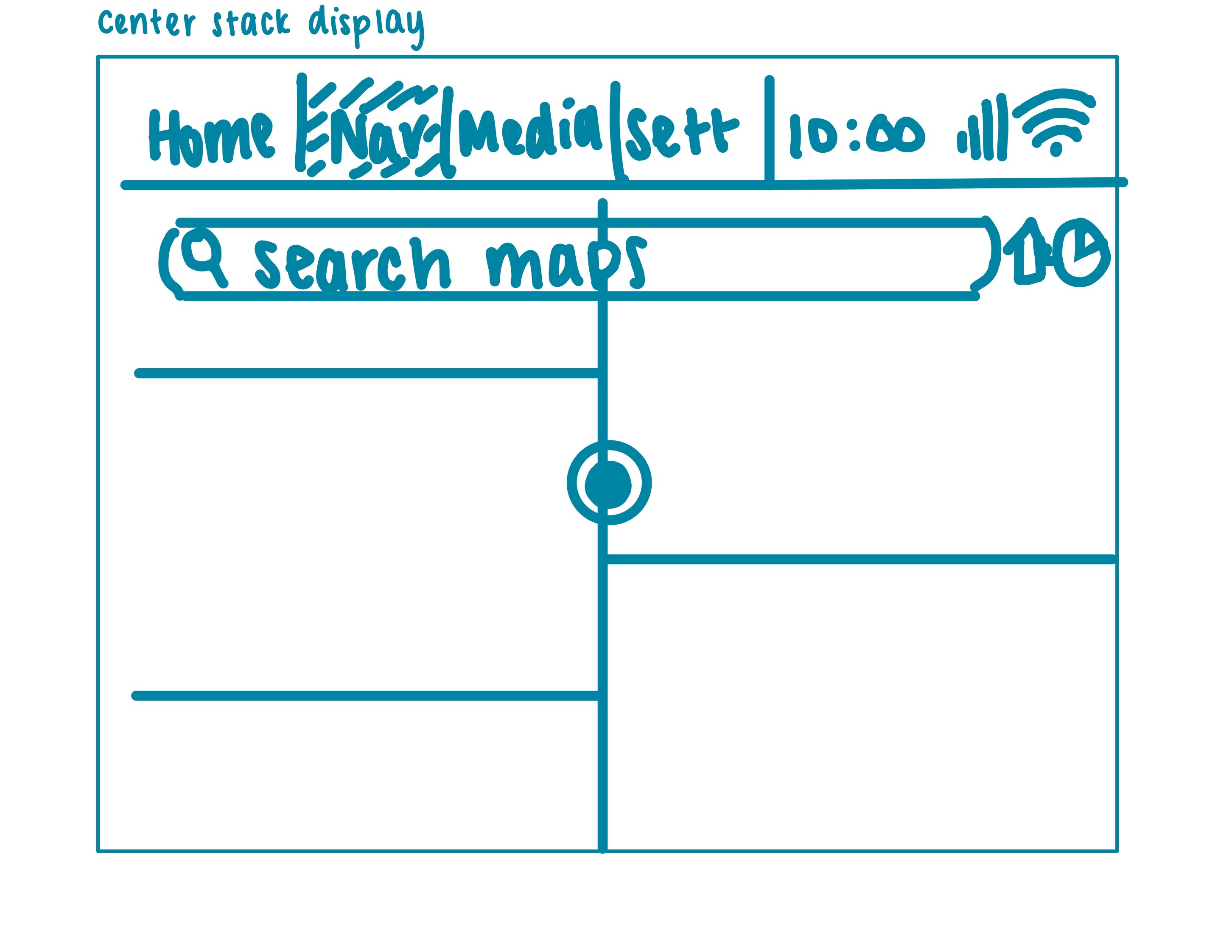
For most tasks, I knew drivers would instinctively look in the center stack display, as it is the central screen of the vehicle.
I split the center stack display into 4 main tabs:
Home
Navigation
Media
Settings
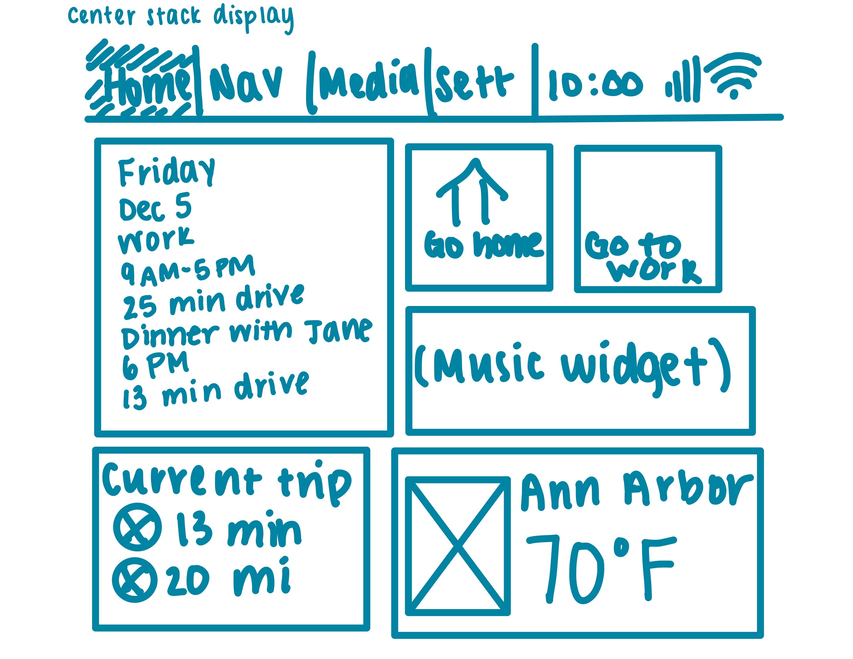
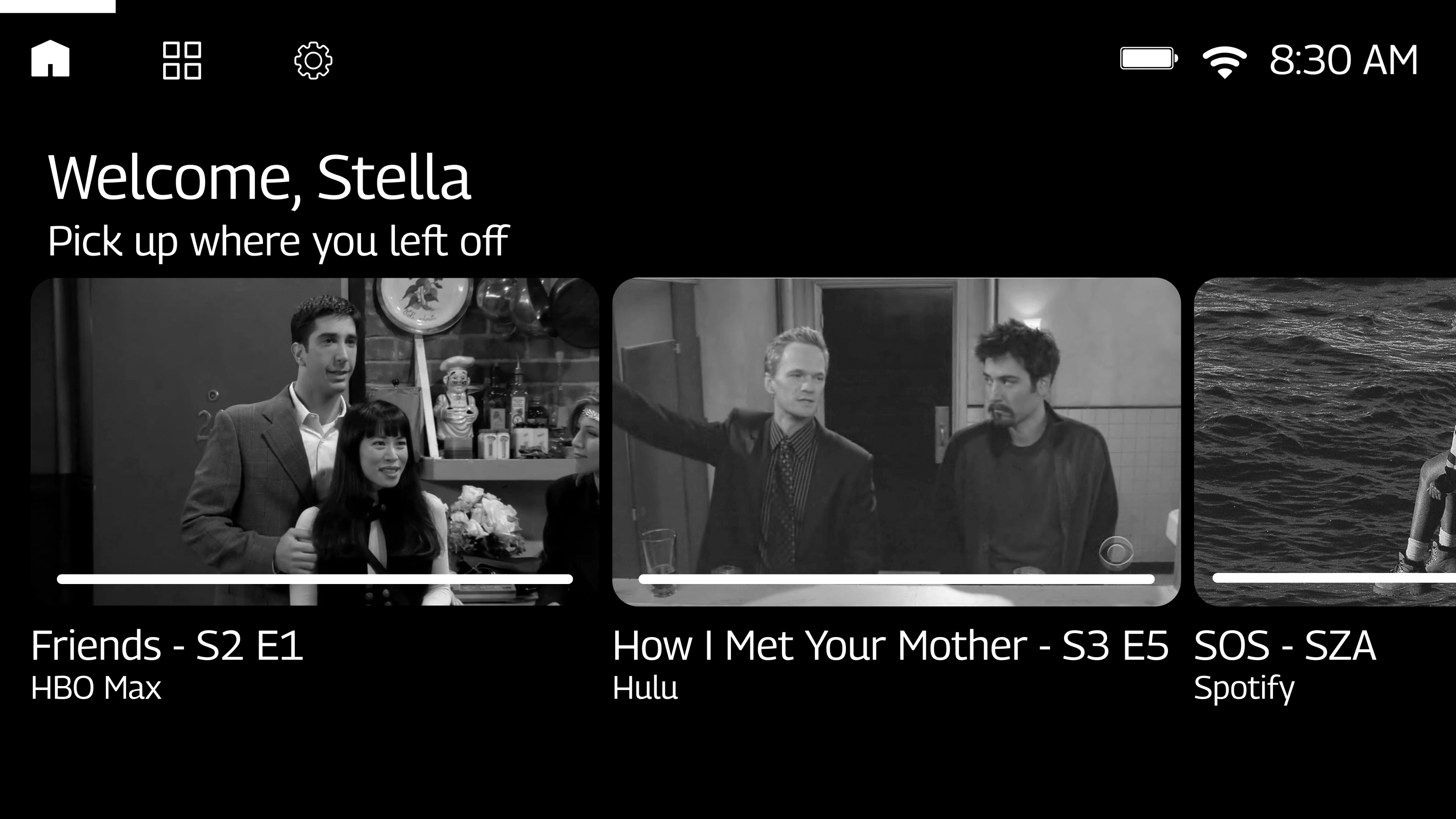
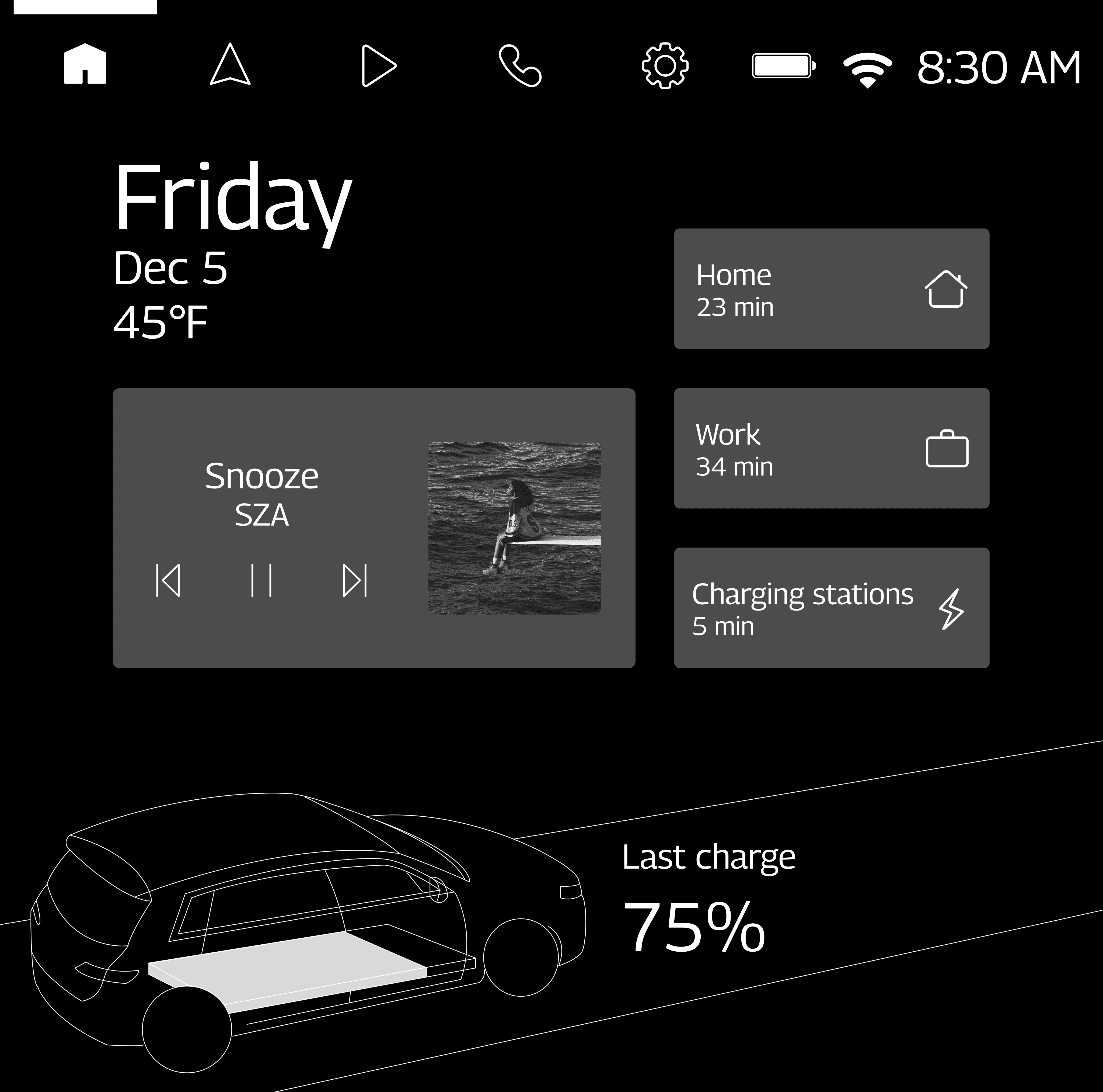
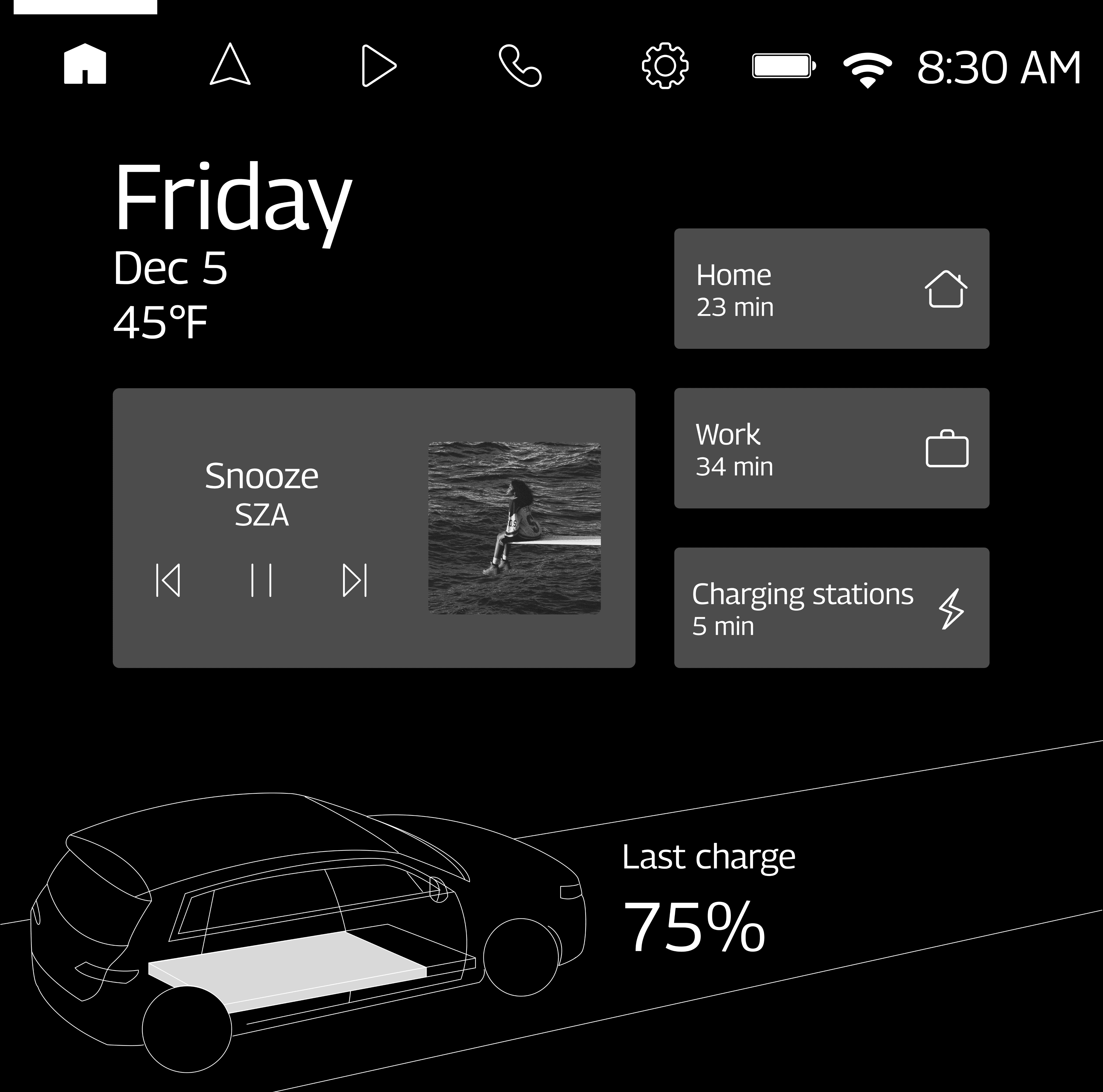
For the home page, I wanted to give users a preview of what they could do from the center stack display. I also wanted to make sure that the most frequent actions that users take could be viewed and accessed immediately from the home page.
Because of this, I ended up creating a widget-based home screen where users can see their media, trip information, a quick navigation link, and more without needing to navigate through any menus while driving.
3
Sub unit display
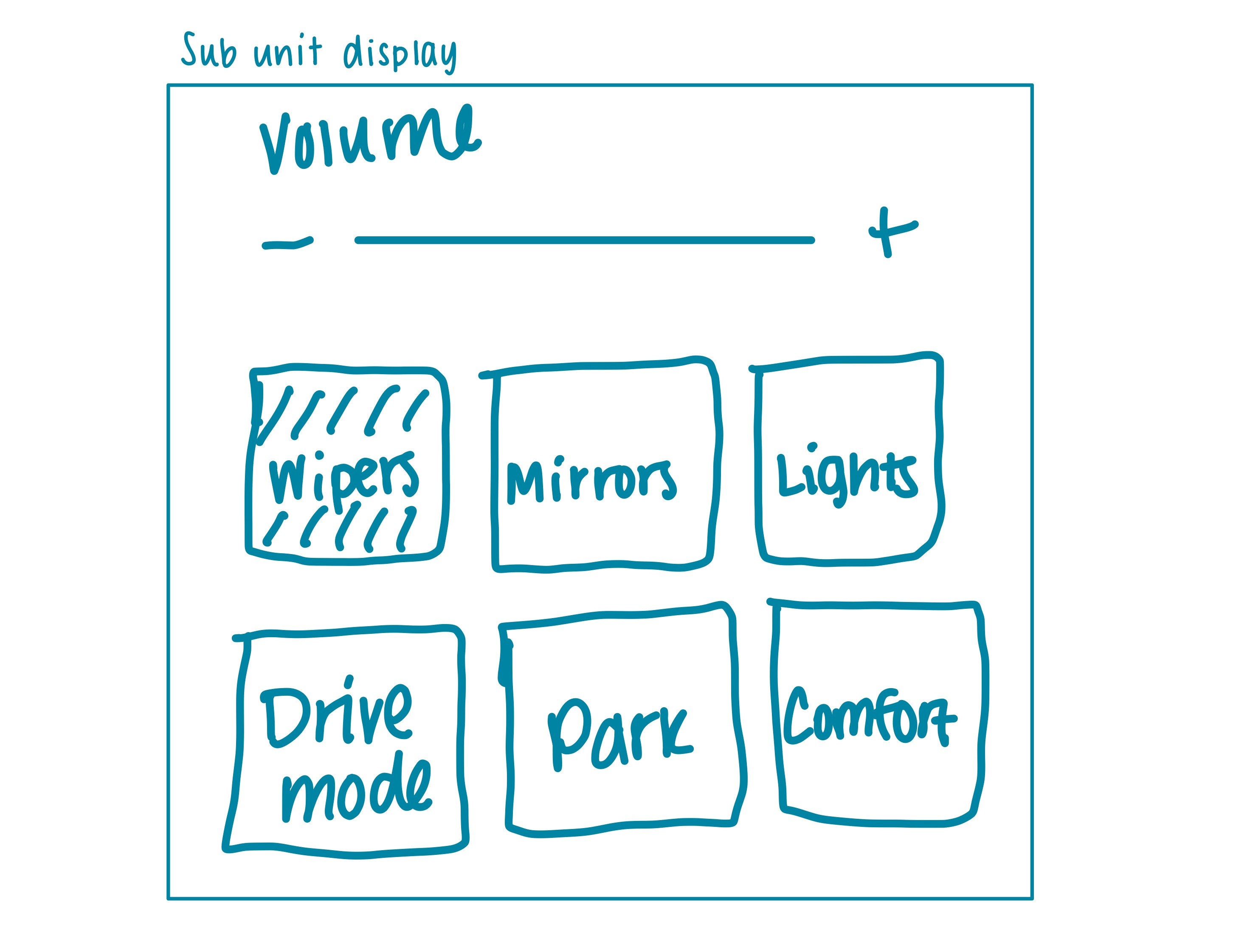
For the sub unit display, I wanted to focus on vehicle controls, as determined by my benchmarking. I used the design brief provided to me by Edenspiekermann to decide what specific vehicle controls to include here. For instance, the brief mentioned that there would be no physical controls for wipers, mirrors, or lights within the vehicle, so I made sure to include those in this display.
4
Passenger display
I felt like I had the most creative freedom with the passenger display. This display can only be accessed by the front passenger, so it is less crucial to the overall driving experience, and therefore, I was able to have a lot of fun designing it. I decided to make it a one-stop entertainment hub where users can ideally connect to all of their streaming platforms for music, podcasts, audiobooks, TV shows, movies, news, and more.
Wireframes
With my overall information architecture decided, I was able to create the following mid-fidelity, unbranded wireframes so that I could begin receiving design feedback from a UX designer at Edenspiekermann.
1
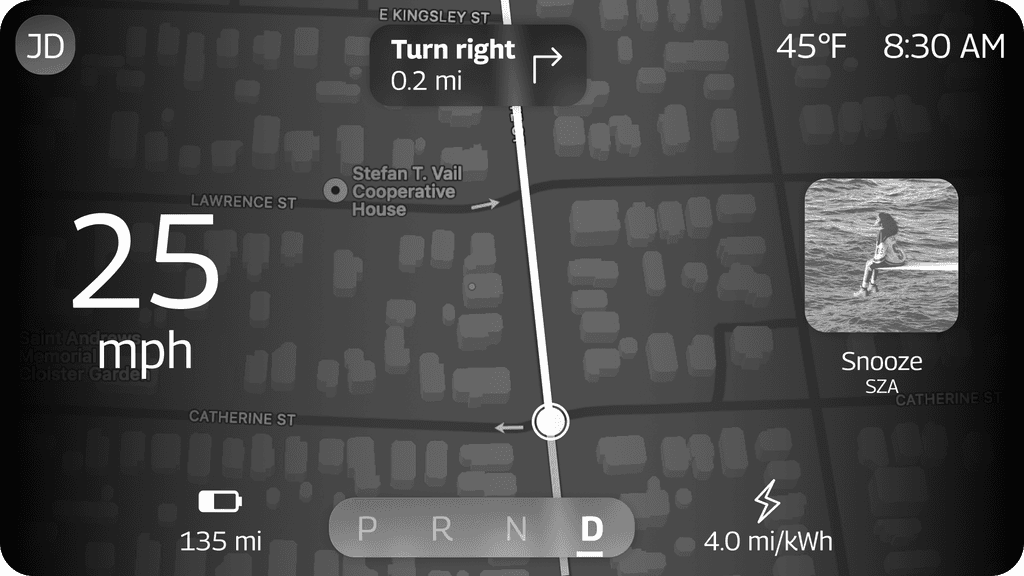
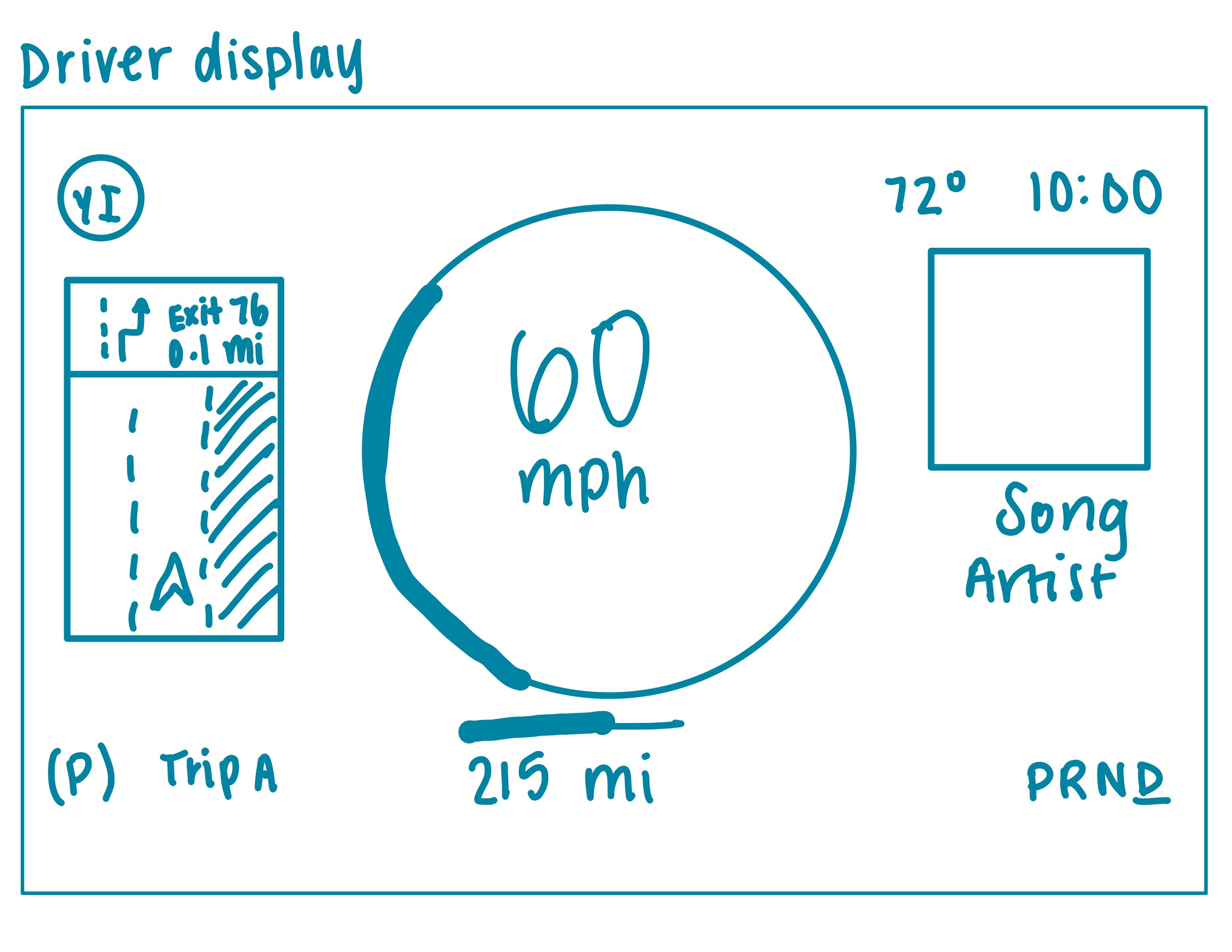
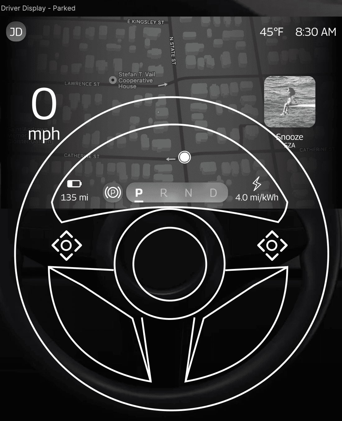
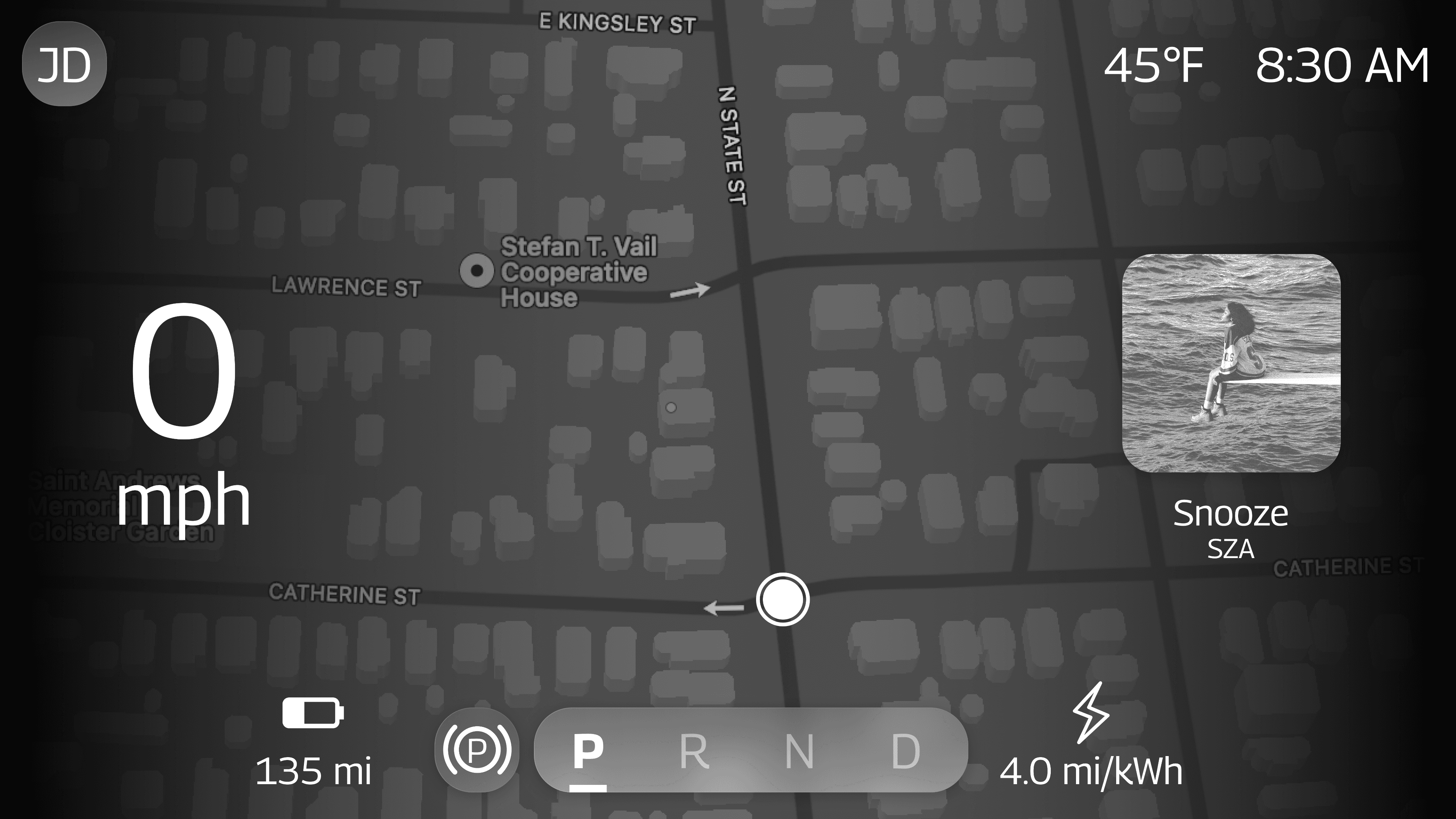
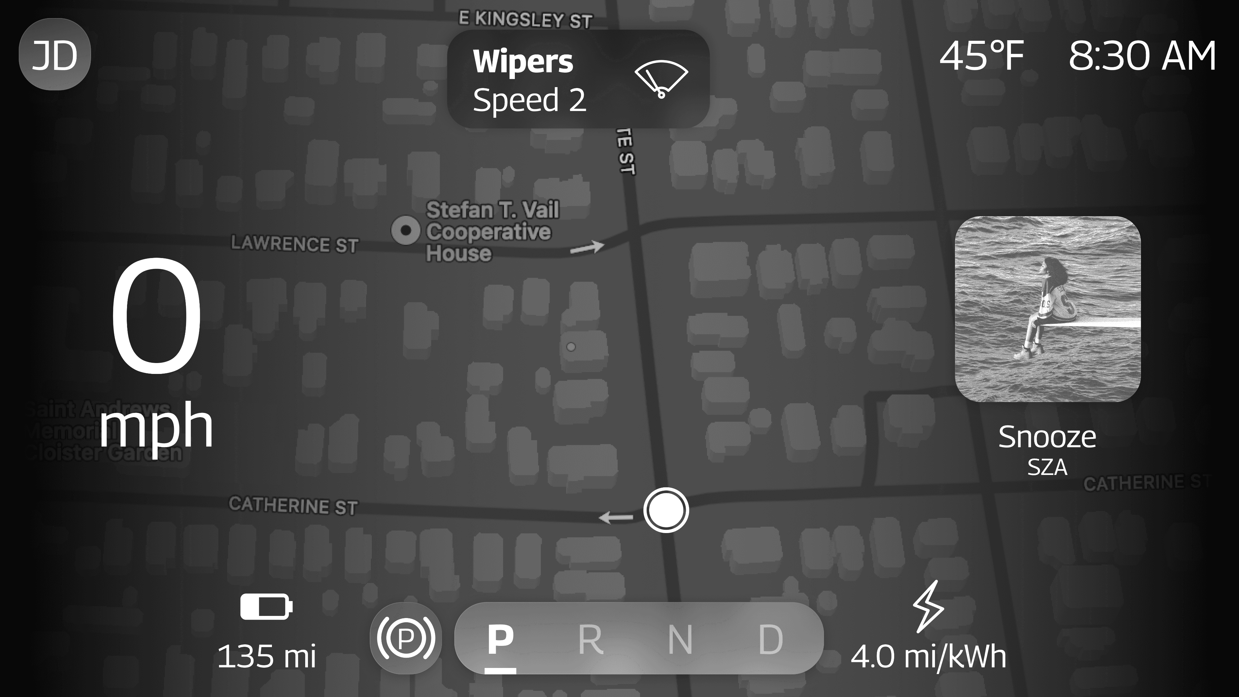
Driver display
Since this is the screen that is closest to the driver’s line of sight, I didn’t want to make it too visually overwhelming. I also wanted to make sure that all of the dynamic information in this display (speed, range, etc.) could easily be identified with just a glance, so I made sure the font size used for everything was as large as possible without making it cluttered.
The largest font size used on this display is for the vehicle’s speed. This was done for safety reasons - drivers can easily see what their current speed is without getting distracted by other interface elements.
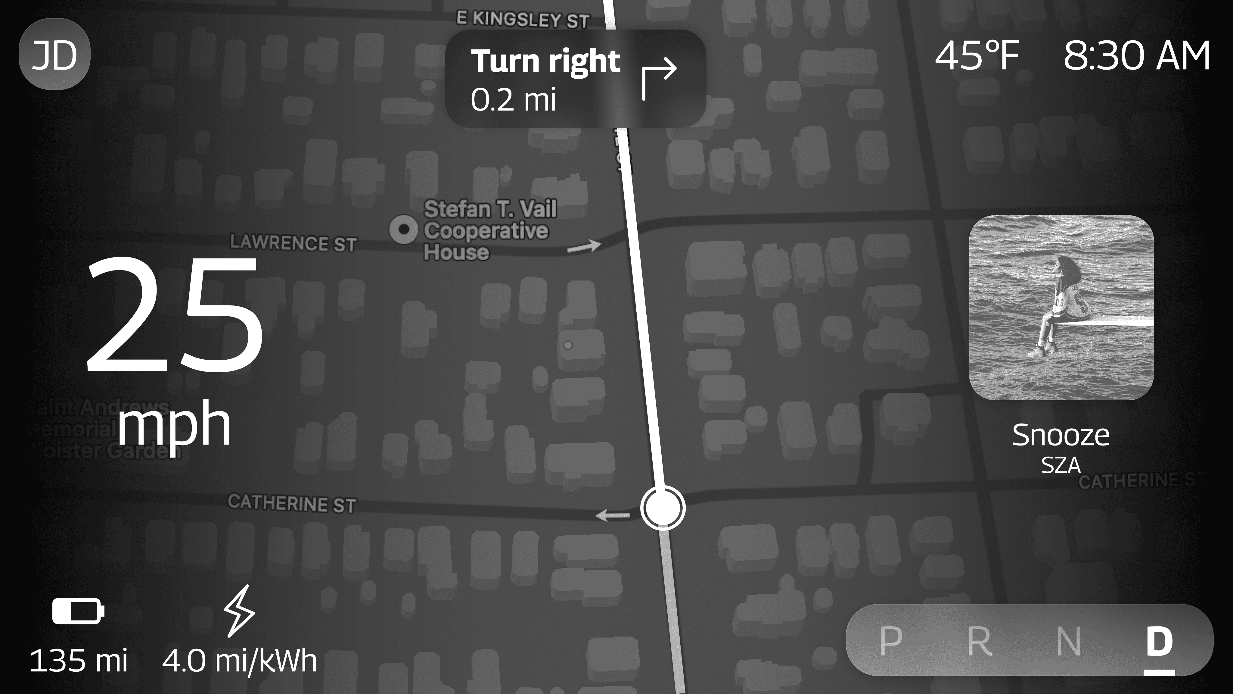
I also added a preview of the currently playing media so that drivers can see this information right above the steering wheel button controls to interact with media.
I chose to allow the navigation to take up the majority of the driver display with the driver’s next turn-by-turn direction centered at the top in order to minimize eyes-off-road time.
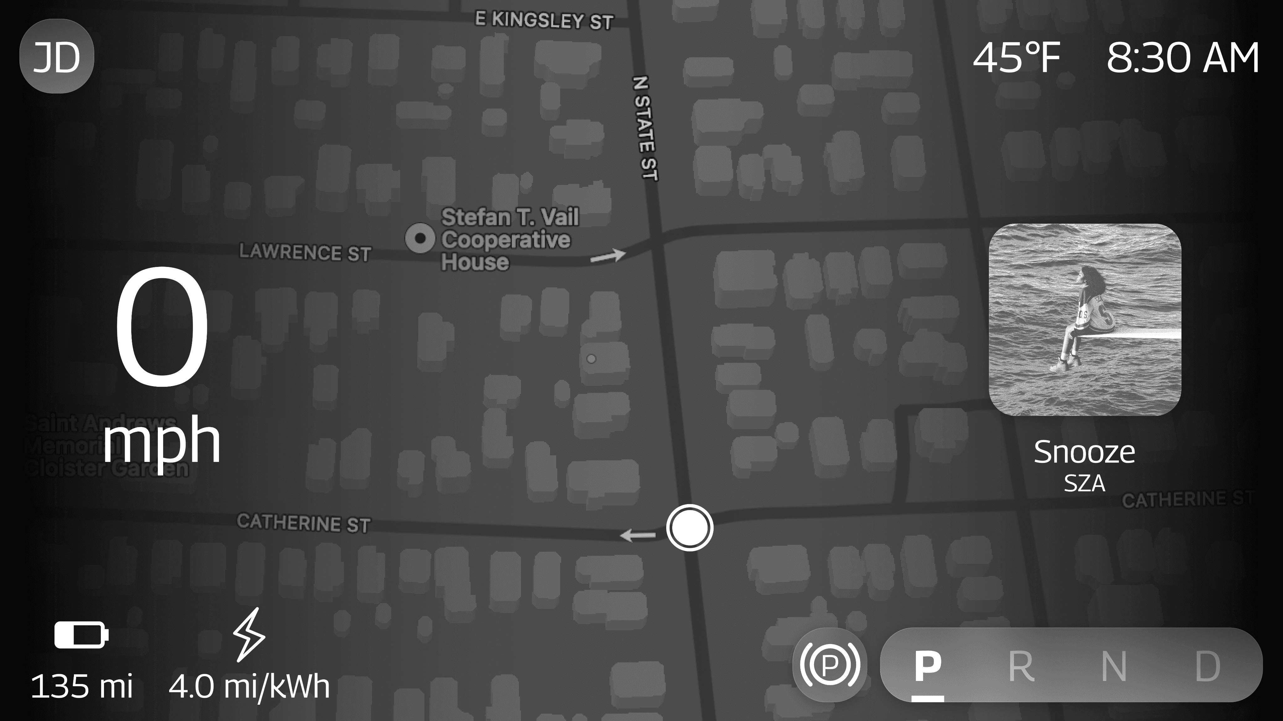
Here is what the driver display looks like when the vehicle is parked and when a trip has not been started yet:
2
Center stack display
For the center stack display, I ended up including fewer widgets than what I had in my original sketch because I didn’t want the interface to be as cluttered.
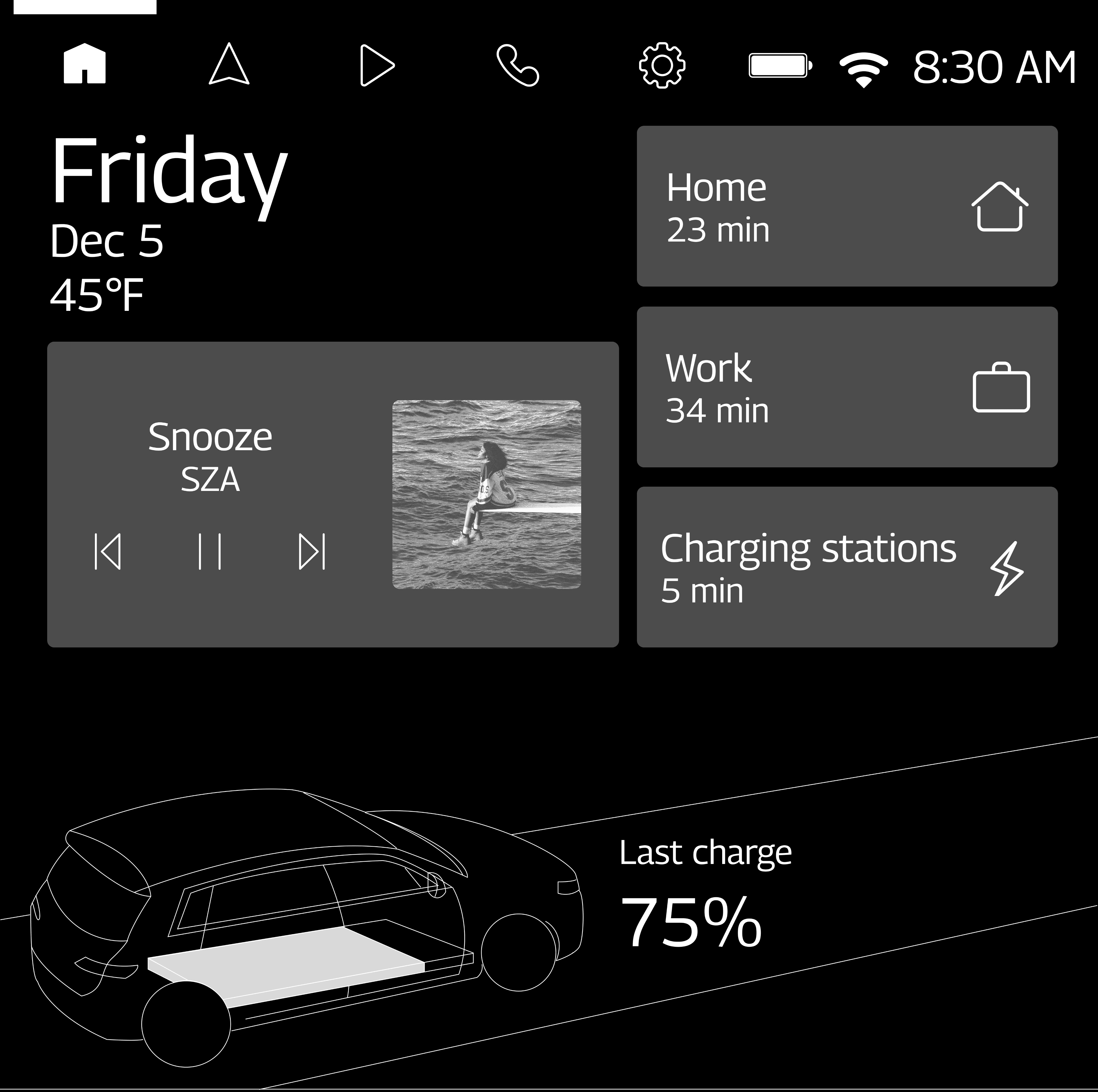
I ended up having widgets for media, quick navigation to common destinations, and nearby charging stations. When these widgets are tapped, their corresponding tabs are opened.
I also included a traced vehicle visualization to show drivers the vehicle’s charge status. Vehicle owners tend to love seeing illustrations and graphics of their vehicle on the displays because of the sense of ownership that they tend to feel over their vehicles. Plus, it provides a more interesting visual for charging status than just a battery icon.

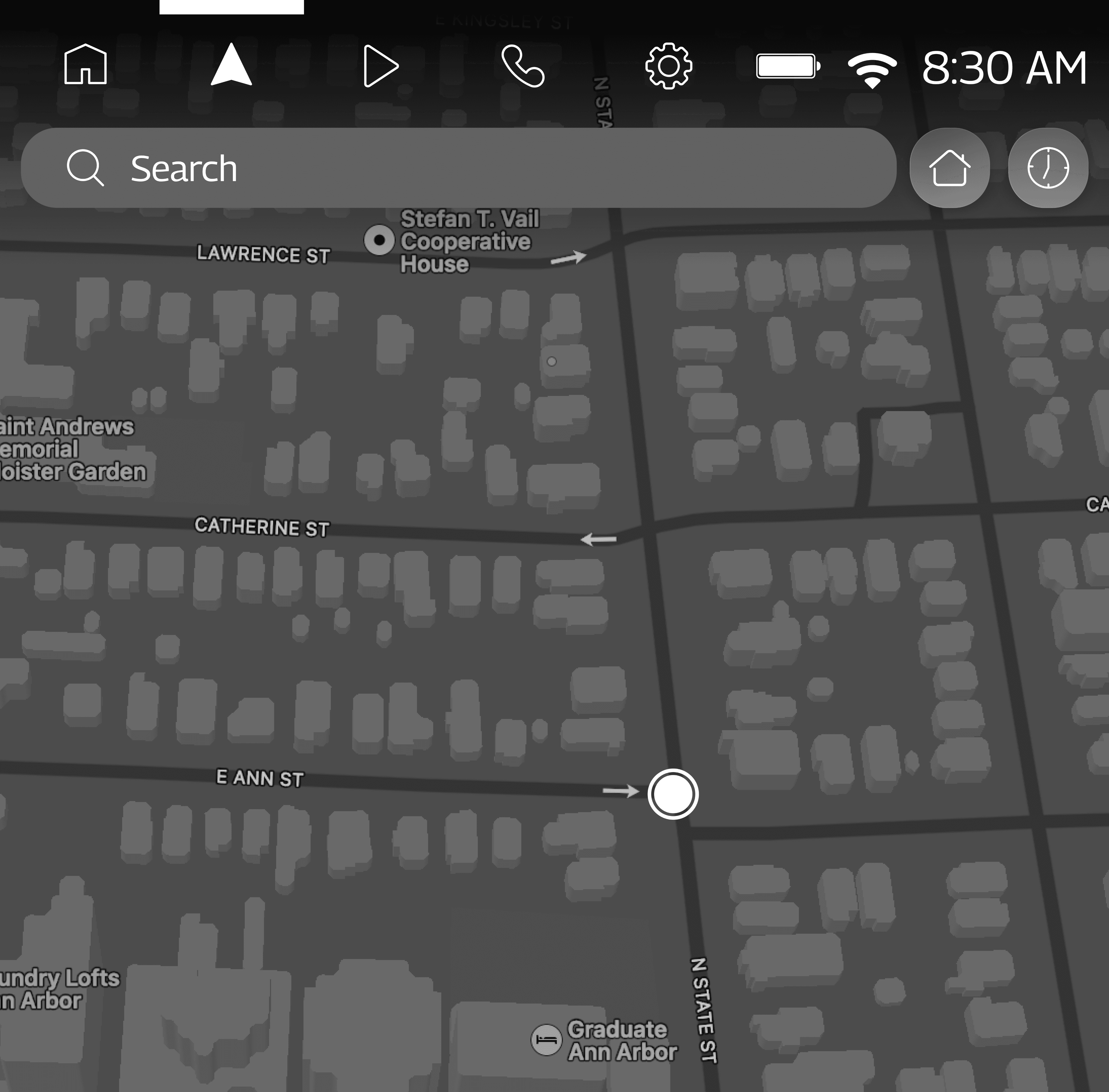
I included buttons to start navigation to the driver’s home and to view the driver’s recent destinations for quick access.
I also made sure to indicate the user’s current location on the map and provide a search bar.
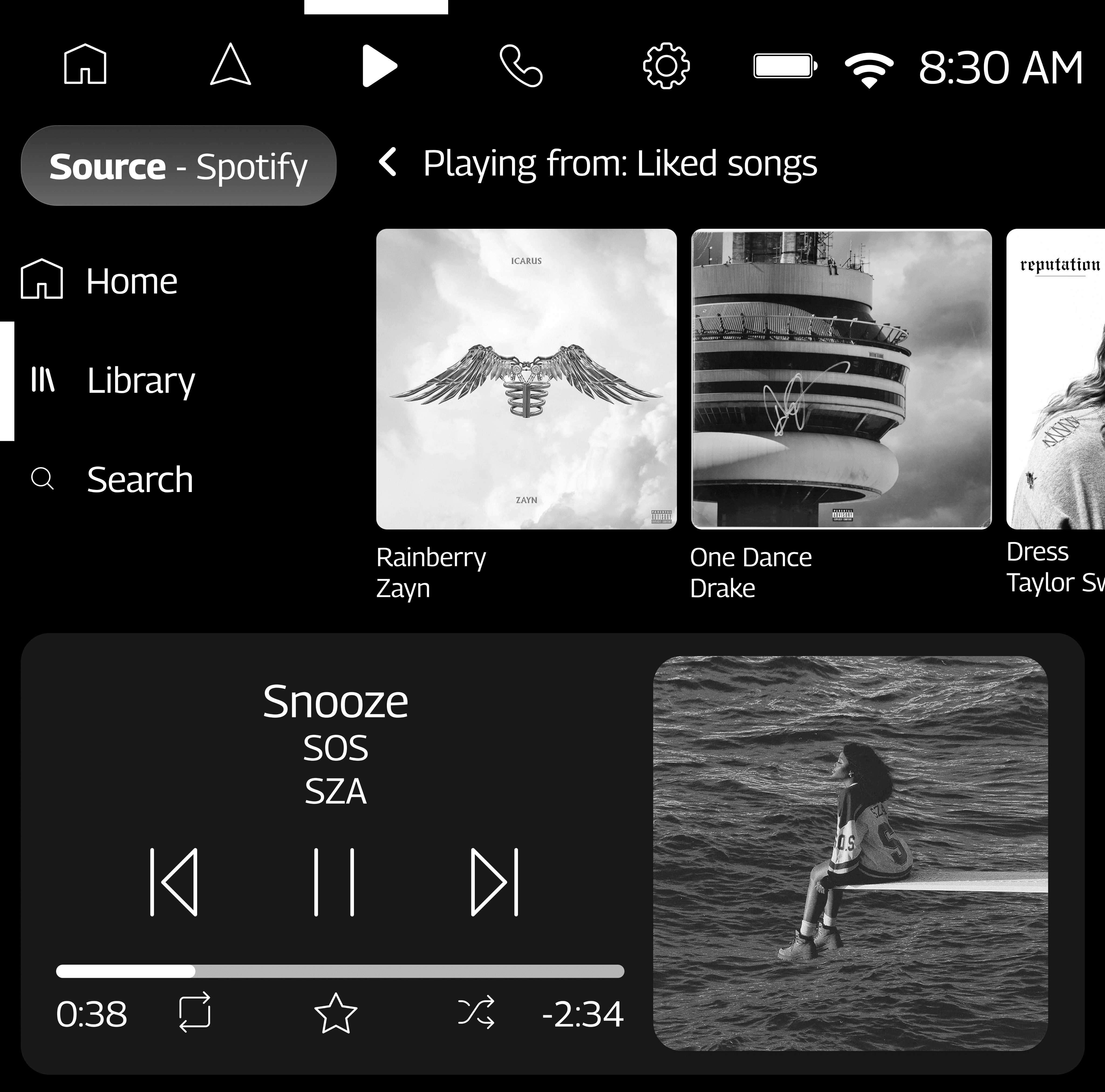
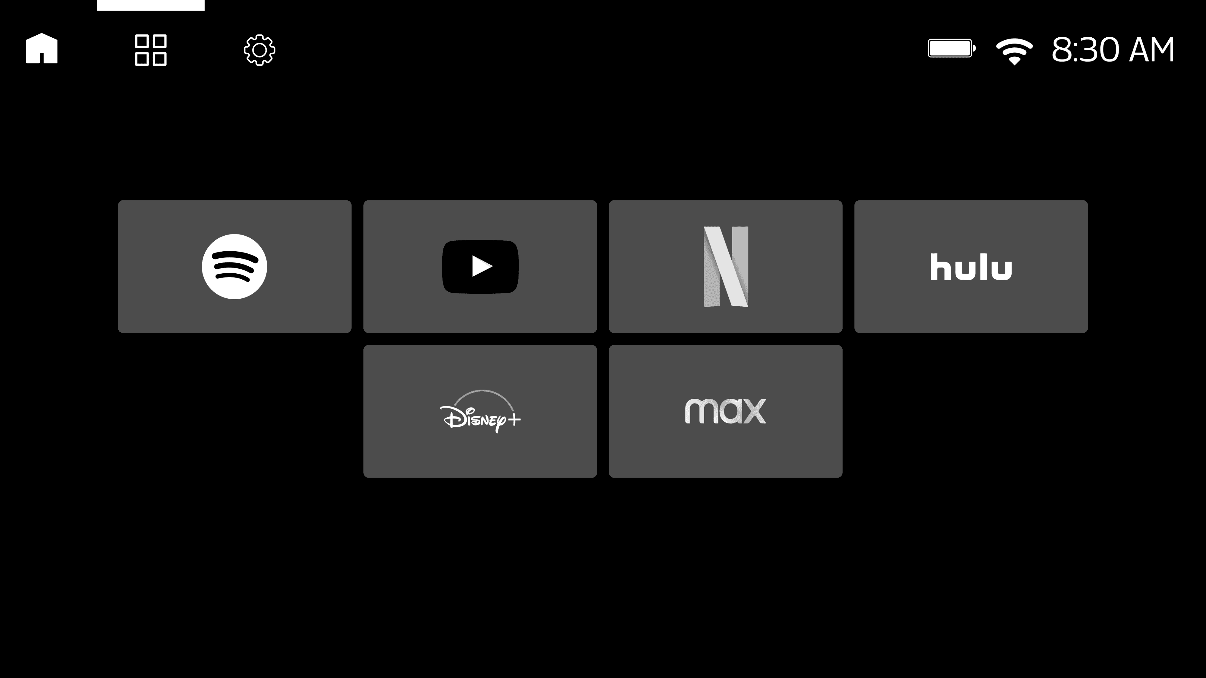
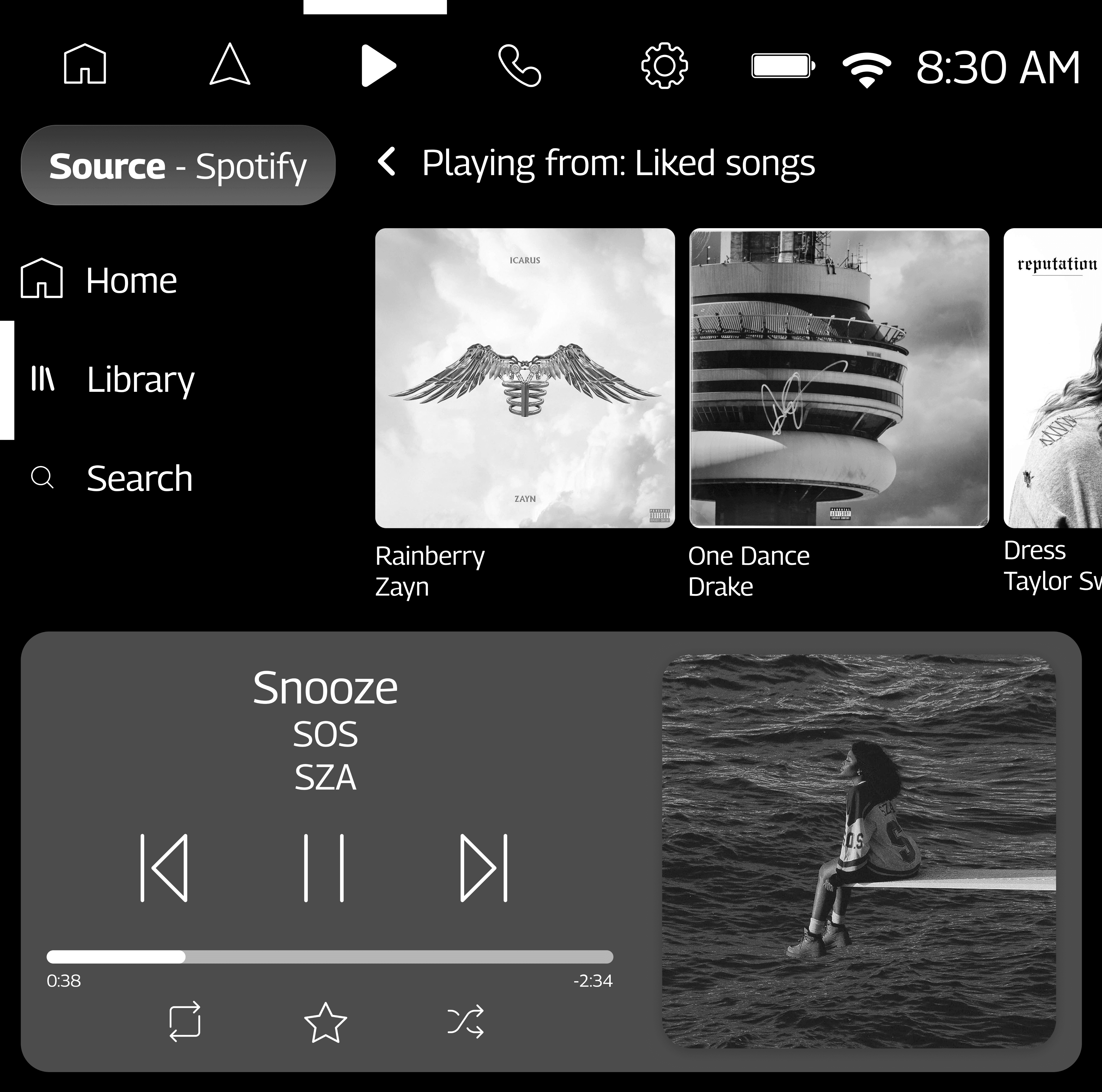
For the media tab, I integrated Spotify, radio, and Bluetooth, as the design brief requested.
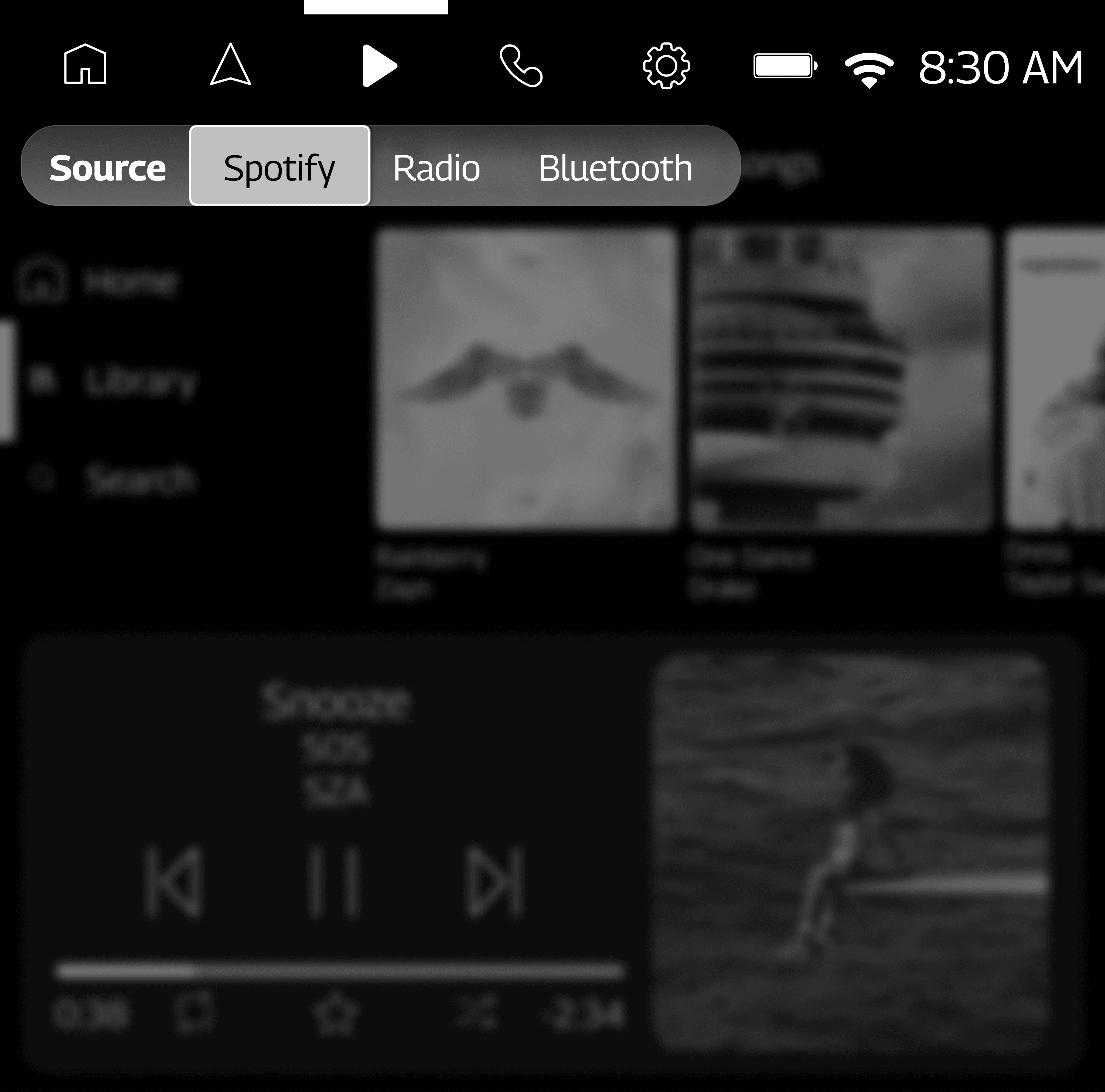
By tapping the source selector, users can switch between the three different sources.
For the settings tab, I added more tabs to toggle between different types of settings.
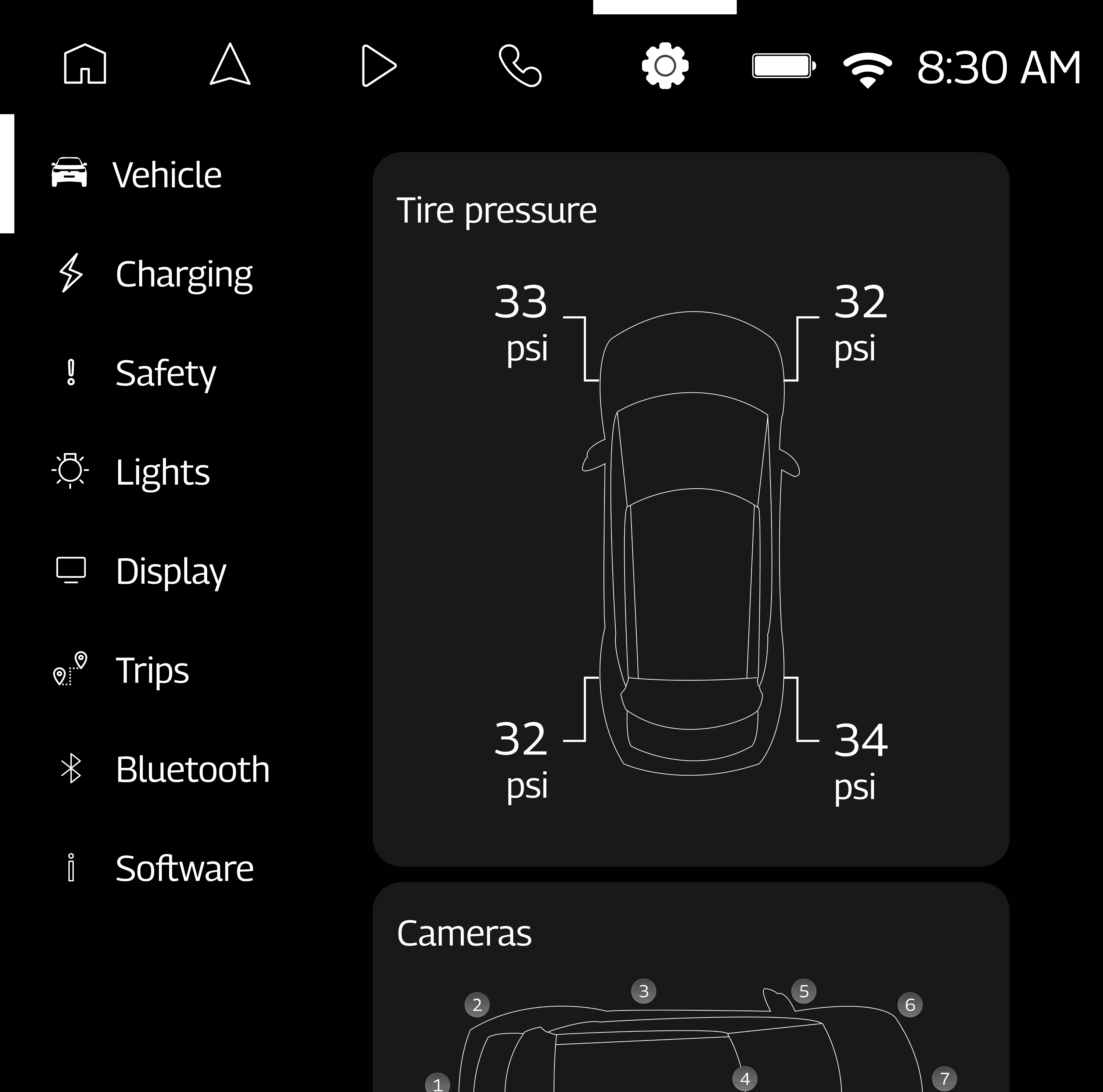
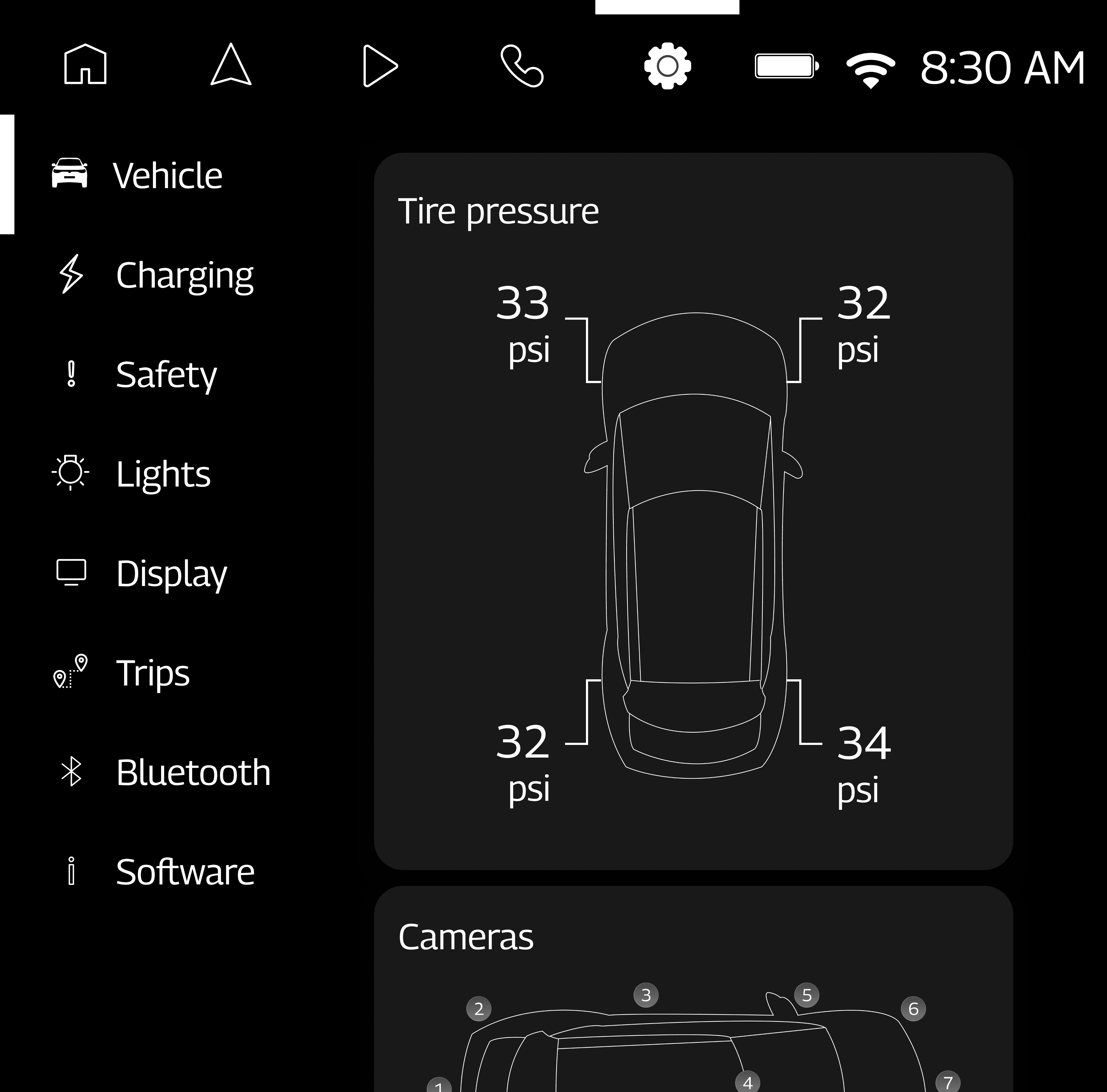
To indicate tire pressure numbers, I knew I wanted a physical representation of the vehicle in the interface so that it was clear which tire each number was referring to.
3
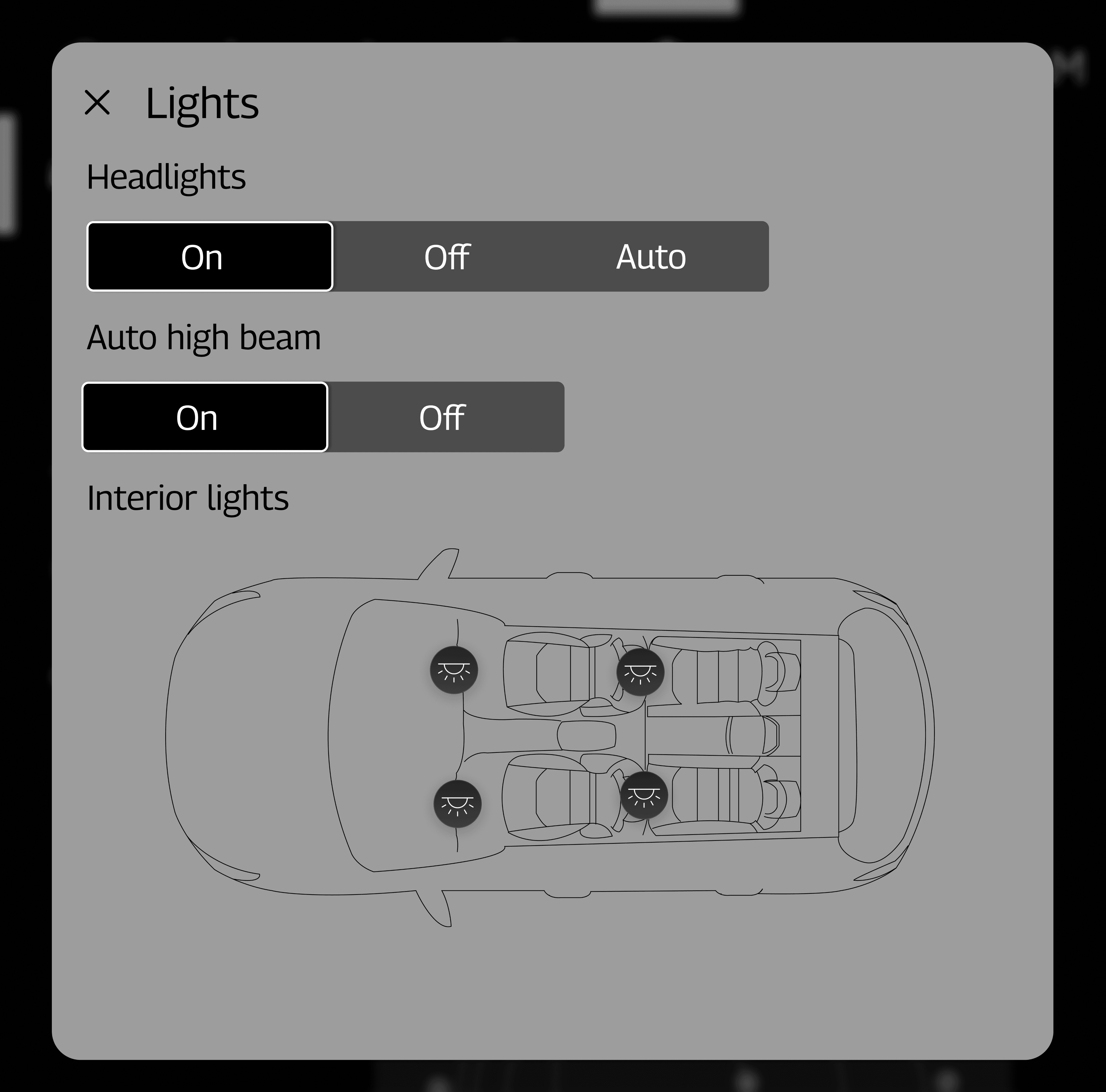
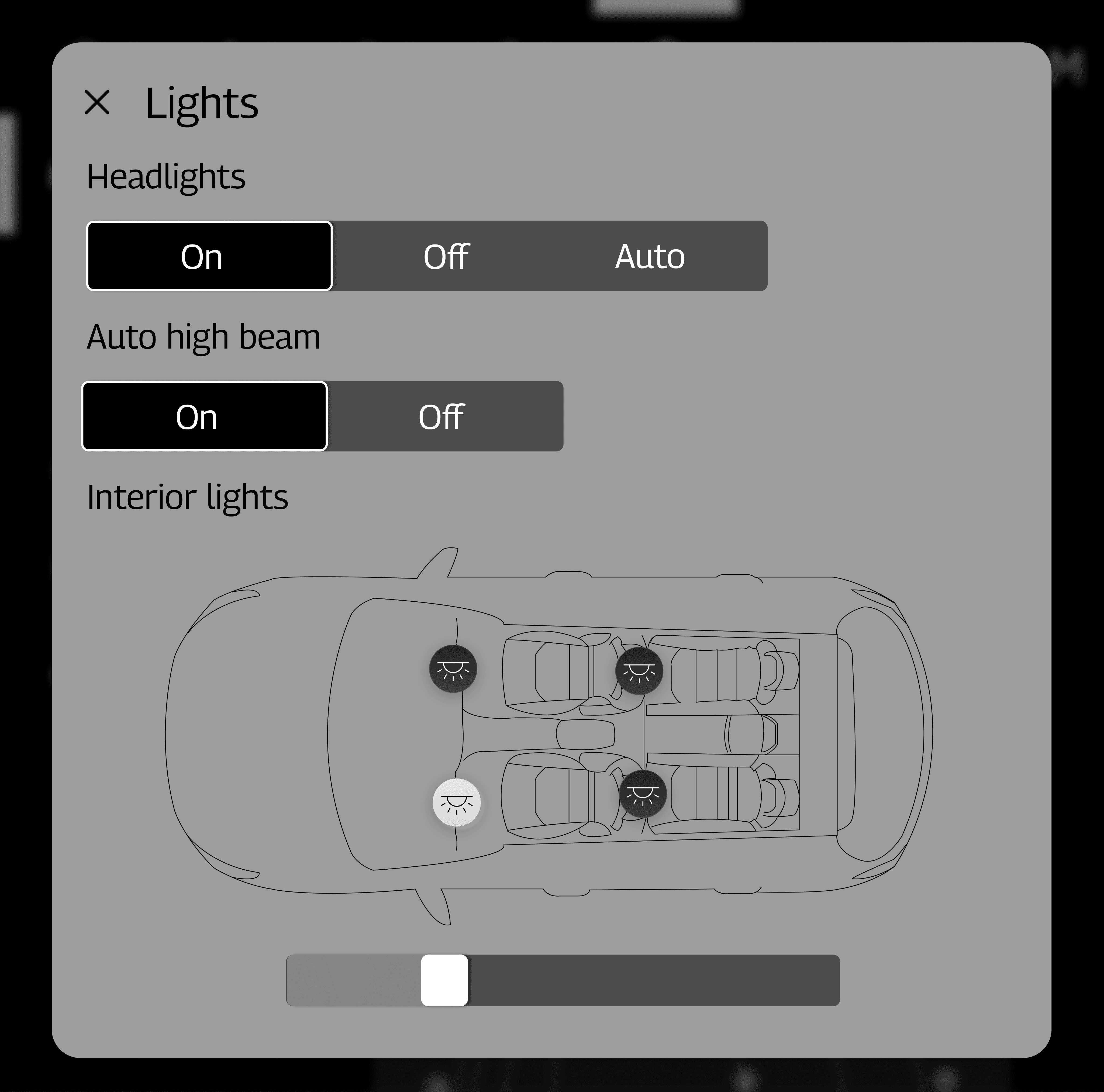
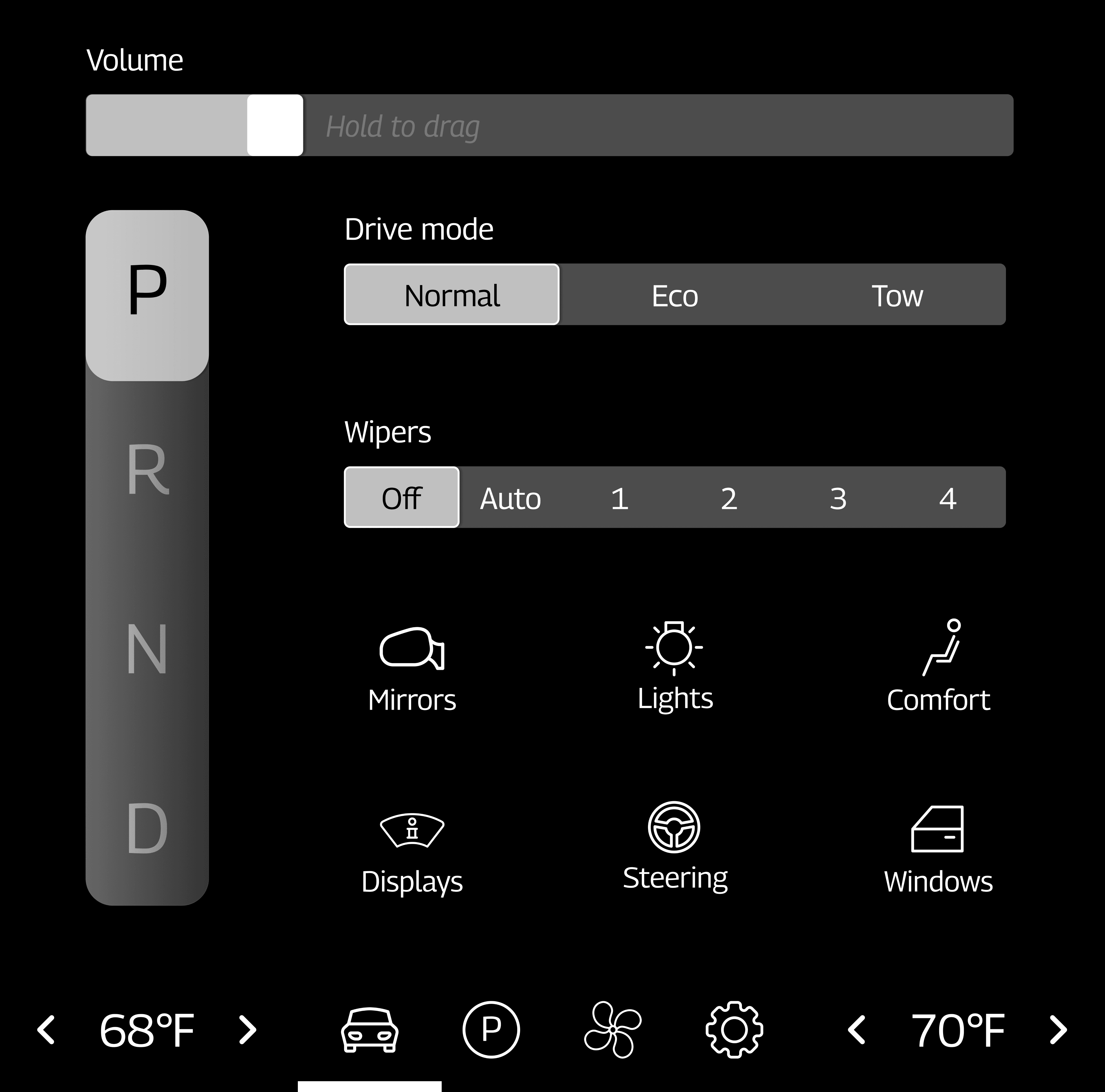
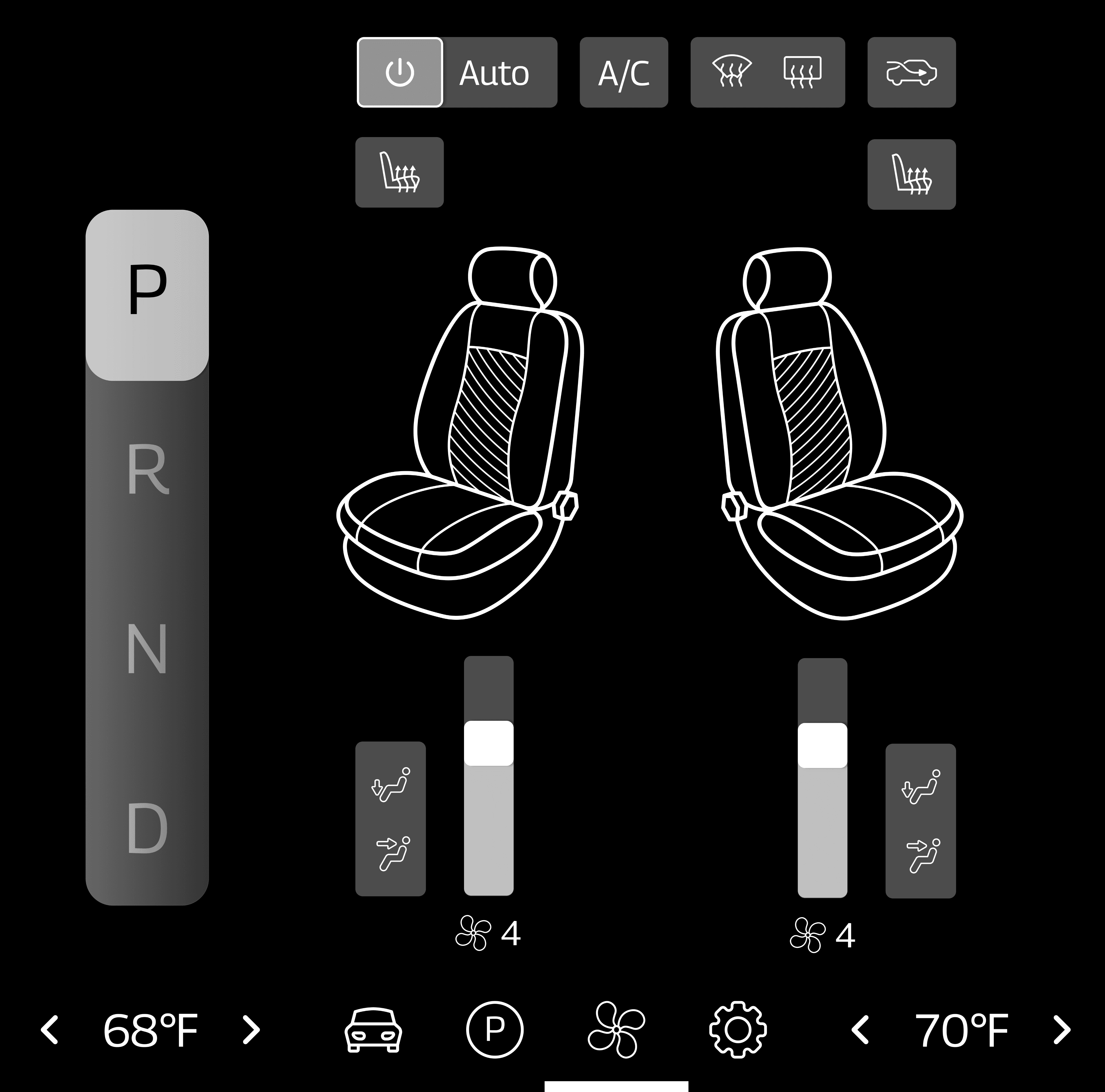
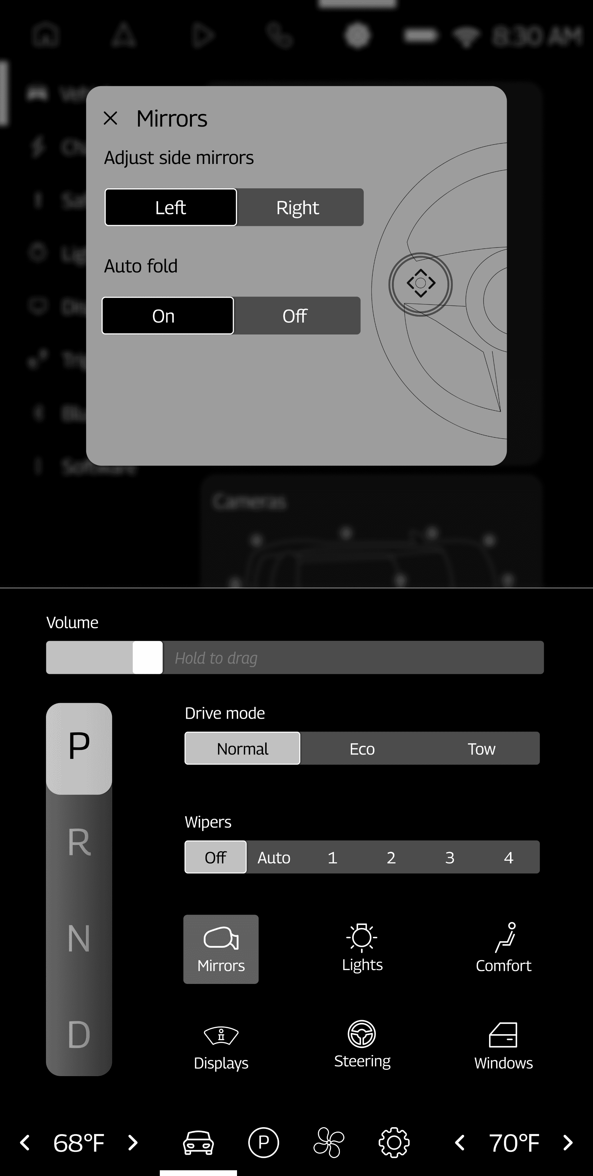
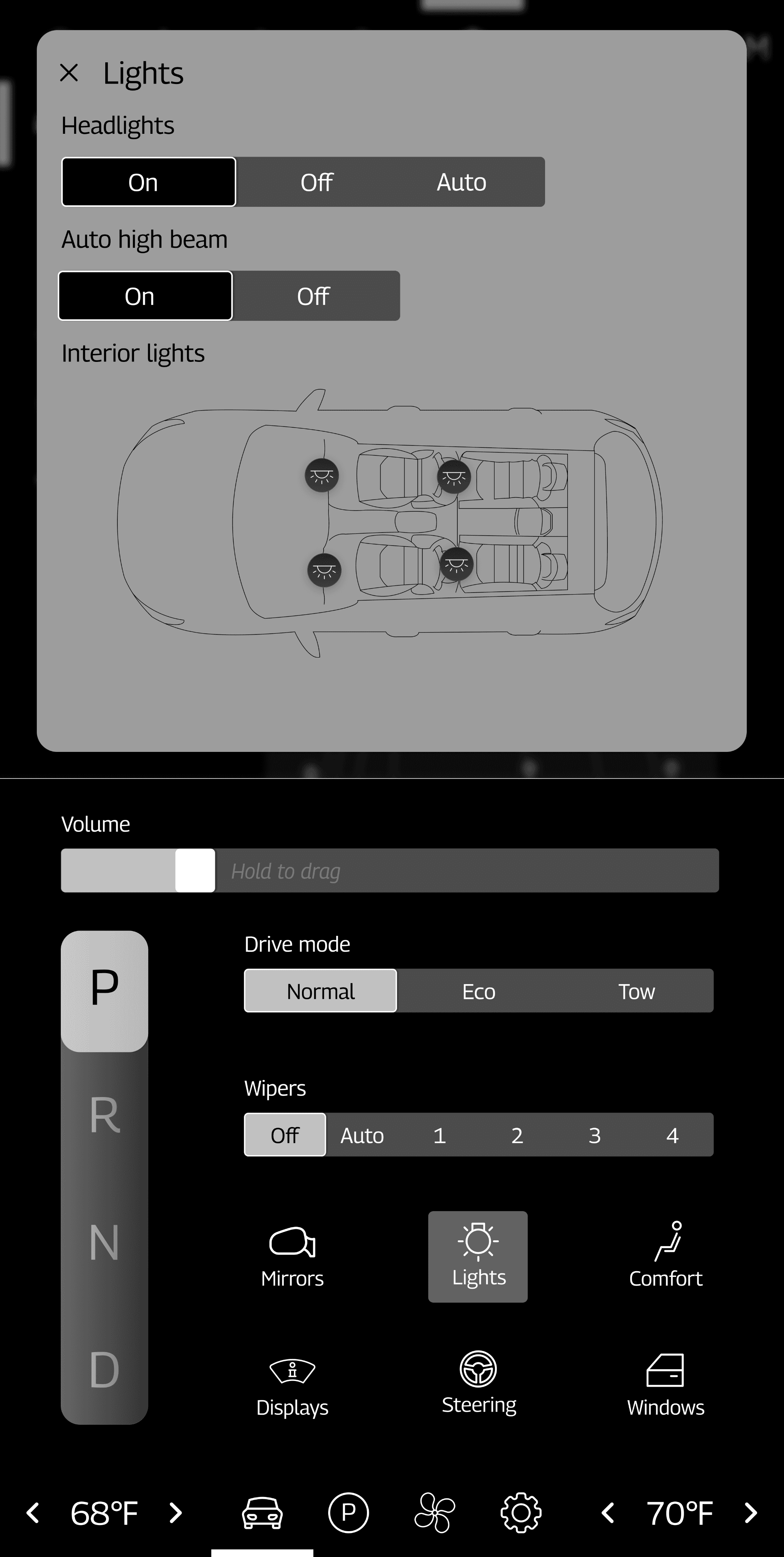
Sub unit display
Again, I chose to focus on vehicle controls for the sub unit display, but I ended up including tabs in this display, too. These tabs change what is shown to the right of the shifter on this display (which was added since there is no physical shifter in this vehicle).
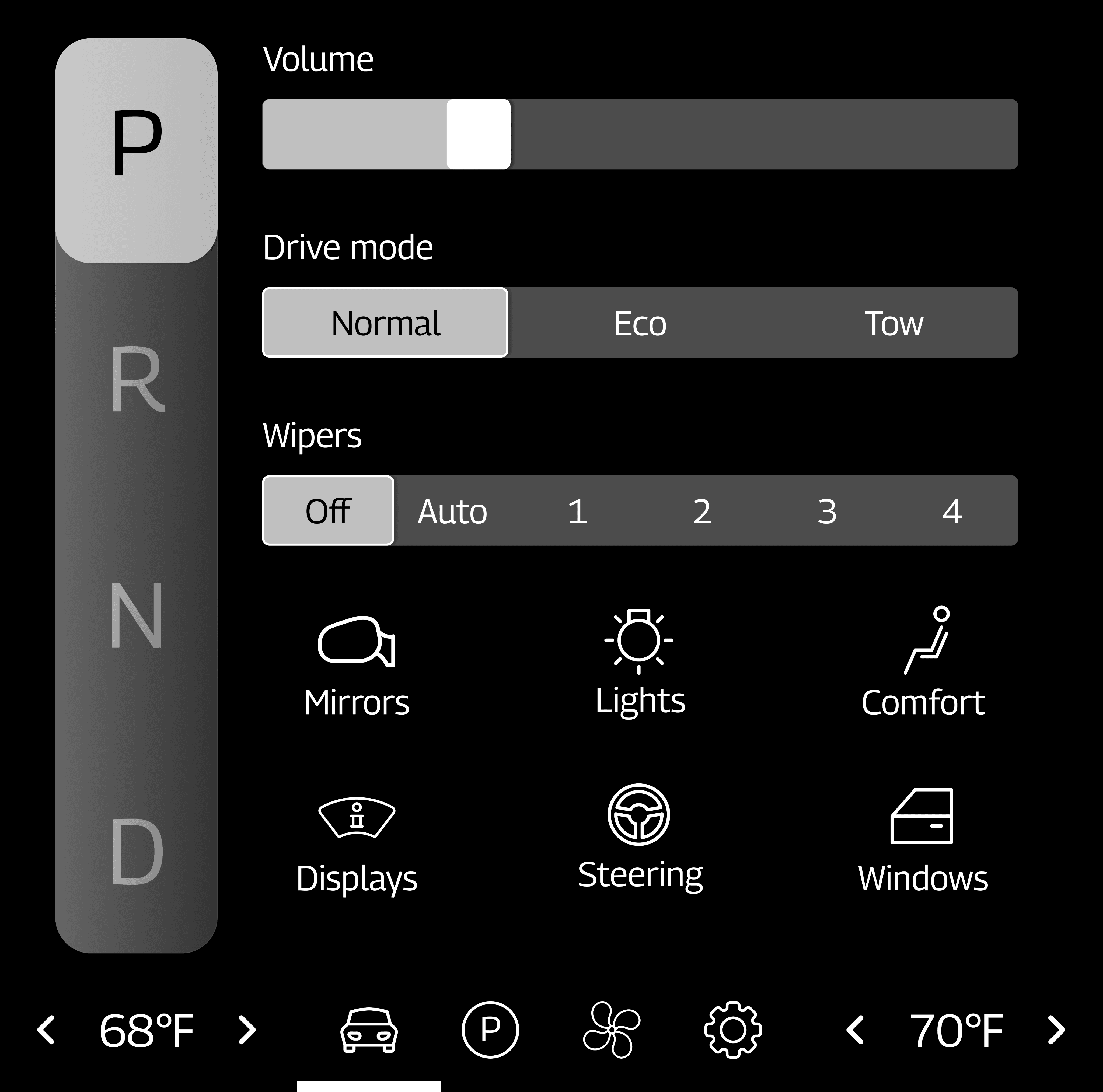
These tabs are vehicle, parking, HVAC, and settings.
Because of the tab system, I decided that each of the following options would open a pop-up in the center stack display instead of taking over the sub unit display. This allows more than one of the vehicle controls to be in use at a time.
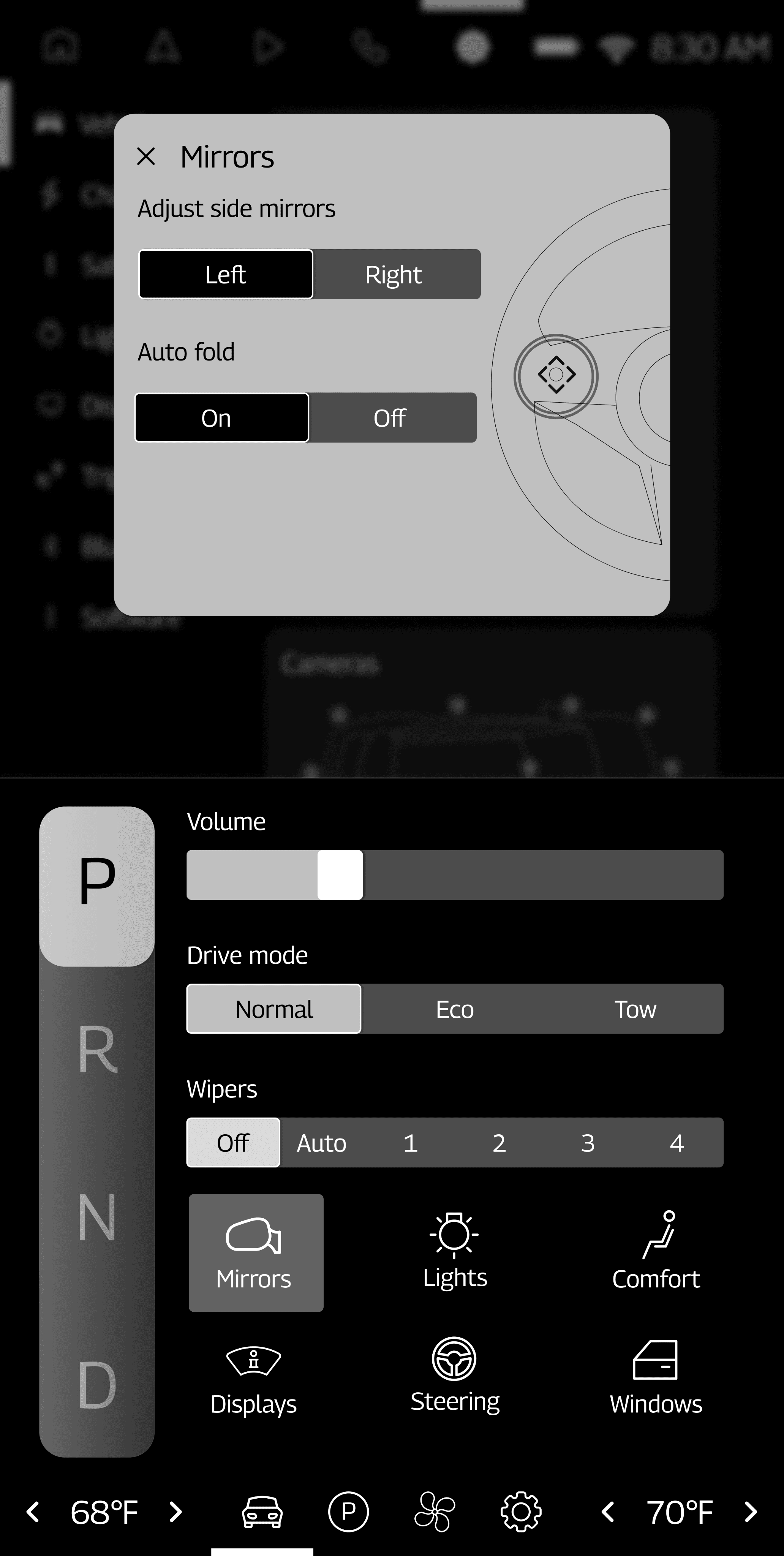
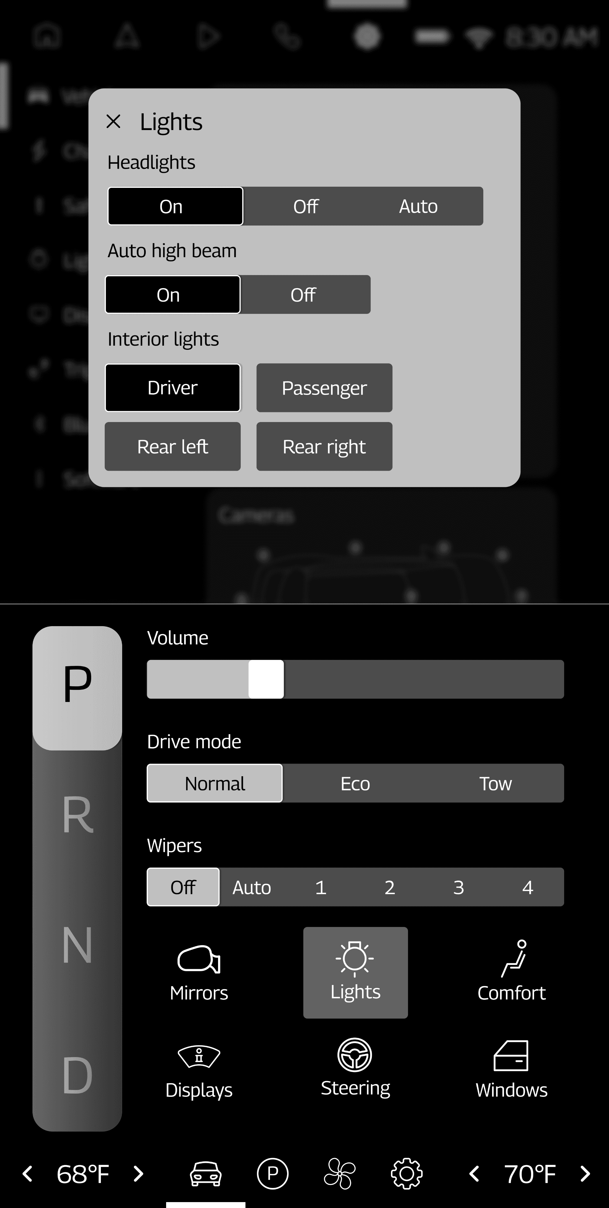
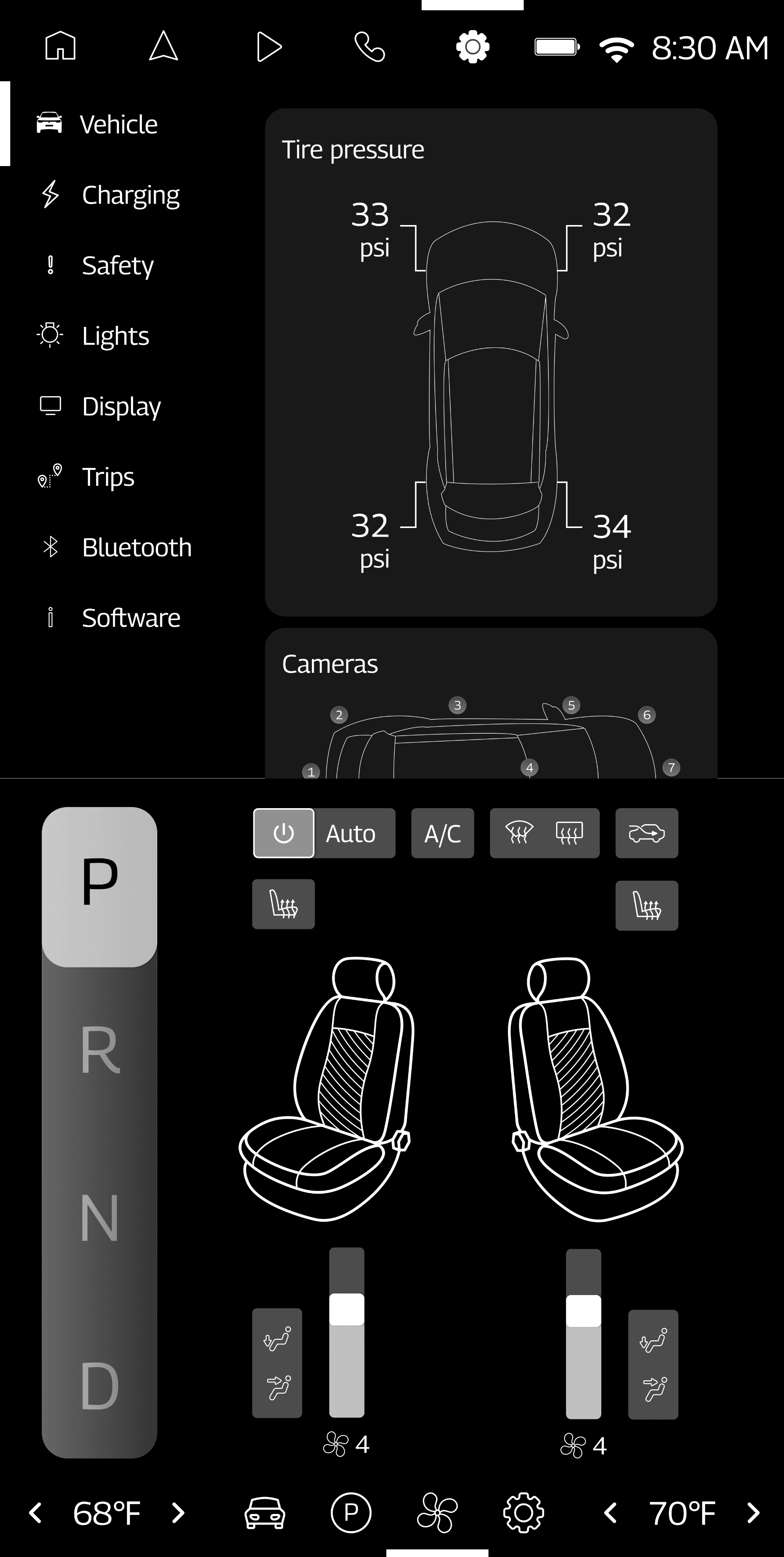
I relied heavily on vehicle visualizations for a lot of the vehicle controls since they show a to-scale representation of the settings that the driver is adjusting.
4
Passenger display
The biggest change from my sketches to my wireframes for this display is that I decided to just include 3 tabs - home, apps, and settings - instead of having one tab for each app. This was done to avoid clutter in the navigation bar.
5
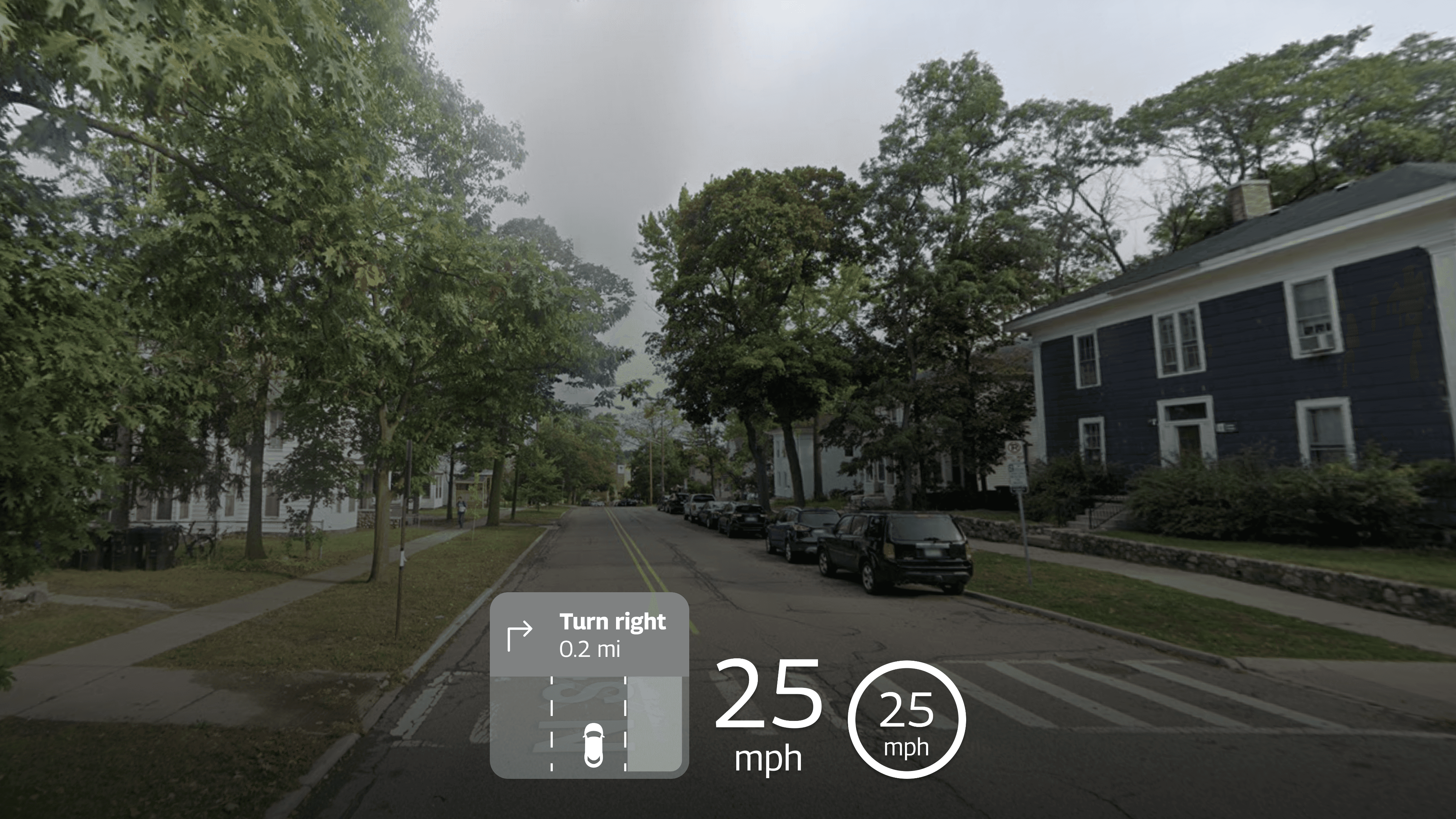
Heads-up display
At this point in the design process, I also began to consider what I wanted the heads-up display to look like. A heads-up display projects an image onto the vehicle’s windshield or a panel just below the driver’s line of sight. Though this helps a lot with decreasing eyes-off-road time, the heads-up display may not be easy to see during different weather conditions or while the driver is wearing sunglasses, so it is crucial that information in the heads-up display can also be accessed in other displays. For this reason, I chose to keep the heads-up display very simple and included the most pertinent information that drivers would need while the vehicle is in motion.

The heads-up display just includes the driver’s next turn-by-turn direction, their current speed, and the speed limit.
Design Feedback and Iterations
As a designer with only a little bit of knowledge about the automotive design space, feedback from other designers who have been in the automotive industry for a while was crucial to making my final designs usable.
Here are the biggest pieces of feedback that I received from Jens Rauenbusch, a UX designer at Edenspiekermann, as well as some of my peers who have experience working with automotive technology.
“The design is very dense overall. Consider adding more depth to navigation.”
“Adjust spacing and padding to avoid overwhelming users with a packed interface.”
This was probably one of my biggest challenges when designing my wireframes - it was difficult for me to find a way to include all of the necessary information and controls without overwhelming the user. Adjusting padding and navigation definitely helped a lot, though.
Before
After
There were also a few logistical considerations that I had not yet made in my designs at this point:
“You should show a way to adjust intensity for the interior lights.”
“Think about strategies to prevent accidental tap on volume.”

“Trace a steering wheel and place that above your driver display to test if any of the essential information falls in a blind spot.”
Overall, since I took the time to lay out my information architecture before designing my wireframes, there seemed to be a good balance of information on each display already.
“Good relationship between screens. Good information hierarchy on screens, most important information clearly visible. Great execution for HUD.”
Final Designs
After incorporating all the feedback I got and going through a few more iterations of my design, here is what my design ended up looking like:
1
Driver display
Driver display when parked:
Driver display with active navigation:

Driver display with wipers on:
2
Center stack display
Home tab:
Navigation tab:
Media tab:
Settings tab:
3
Sub unit display
Main tab:
HVAC tab:
Mirrors selected:
Lights selected:
4
Passenger display
Main tab:

All apps:

5
Heads-up display
Next Steps
If I were to continue working on this project, I would focus on doing the following:
Creating a design system
The main focus of this project was information architecture, so all of the wireframes were done in black and white and without any branding elements. I would have loved to get a chance to think about branding and visual design elements that would appeal to the persona I created.
Further adjustments to spacing
Although I was able to adjust spacing quite a bit between my iterations, upon review of my work, I feel like the sizes of different elements could be adjusted further to allow for more breathing room between elements, especially on the media tab of the center stack display. I initially wanted to make everything as big as possible so that drivers could easily read everything in a couple glances while driving, but some elements don’t need to be accessible at all times to the driver, so I think I could have reduced those elements’ sizes.
Designing more pages
Although I put together wireframes for quite a few pages, there are still many pages and features that I did not make in-depth wireframes for. I think a great challenge would be figuring out how all the different pages would be laid out and how they would interact with each other. I specifically think fleshing out the detailed navigation page and the different settings tabs in the center stack display would be interesting.
Learnings
Designing in an unfamiliar domain
This was one of my first explorations in the automotive UX space, and I had to learn about a lot of different constraints and regulations, like those published by the National Highway Traffic Safety Administration (NHTSA). Safety is the number-one priority in the automotive industry, and it was interesting to see how that influenced my designs and how I had to consider things like blind spots in the driver display that could be blocked by the steering wheel.
Vehicle tracings
This was my first time tracing real-life objects using the pen tool in Figma, and I was surprised at the quality of the tracings that I was able to produce without needing to open Adobe Illustrator. These tracings added a touch of realism and ownership to my designs, and I think they were able to take this project to the next level. They also help give users a to-scale representation of different features within the vehicle without needing to read a lot of text or watch videos. This has definitely inspired me to include tracings of other objects in other projects that I work on.