Dress for Success Washington D.C.
Website Redesign
An uplifting platform empowering women to pursue their career aspirations.
Estimated reading time: 4 minutes
Project duration: 8 months


Project Overview
Date
Sep 2023 - Apr 2024
Team
Susan Kyles - Executive Director & CEO of DFSWDC, Client
Angela Jones - Program Manager at DFSWDC, Client
Eileen Rixman - Volunteer at DFSWDC, Client
Rishma Balakrishnan - Project Manager, UX Designer
My role
Client communications, research lead, design lead
Dress for Success, Washington D.C. (DFSWDC) is a nonprofit organization that offers career and workplace resources for low-income women. DFSWDC relies on volunteers to help with various aspects of their program that assist women to land jobs, receive professional attire, and participate in career coaching.
This project included a redesign of multiple pages of DFSWDC’s mobile website as well as the design of a completely new personal dashboard page.
Problem Statement
As DFSWDC shifted more services online, the website became a critical gateway, but it wasn't meeting users where they were.
Initial research and usability testing revealed that many users:
Struggled to understand what services were available and who they were for
Had difficulty navigating between programs, resources, and next steps
Felt overwhelmed by dense content during already stressful life moments
The core problem:
How might we redesign DFSWDC's website to reduce cognitive load, improve task success, and create a supportive, confidence-building experience for women seeking career help?
Process
I began by grounding the redesign in user research to understand both functional barriers and emotional context.
To do this, I conducted:
1
Heuristic evaluations to identify usability and accessibility gaps
7/10 heuristics were violated
Visibility of system status
Career coaching registration process is confusing and does not have a clear step-by-step process.
Error prevention
There are many hyperlinks that open in the same tab without prompting the user about leaving the page first.
Flexibility and ease of use
Resources are embedded in hyperlinks within large paragraphs of text, so they are easy to miss. There should be an easier way for users to find resources.
Help and documentation
It is unclear how users are supposed to get help if they cannot find what they are looking for on the site.
Consistency and standards
There are many buttons that appear to be the same thing, but lead to different redirects.
Recognition rather than recall
There is a navigation bar for parsing through the site; however, the path to finding specific resources is unclear and it is difficult to understand what each of the navigation bar items means.
Aesthetic and minimalist design
There are a lot of unnecessary details, links, and pages within the website. The colors used on the site can also be visually overwhelming.
2
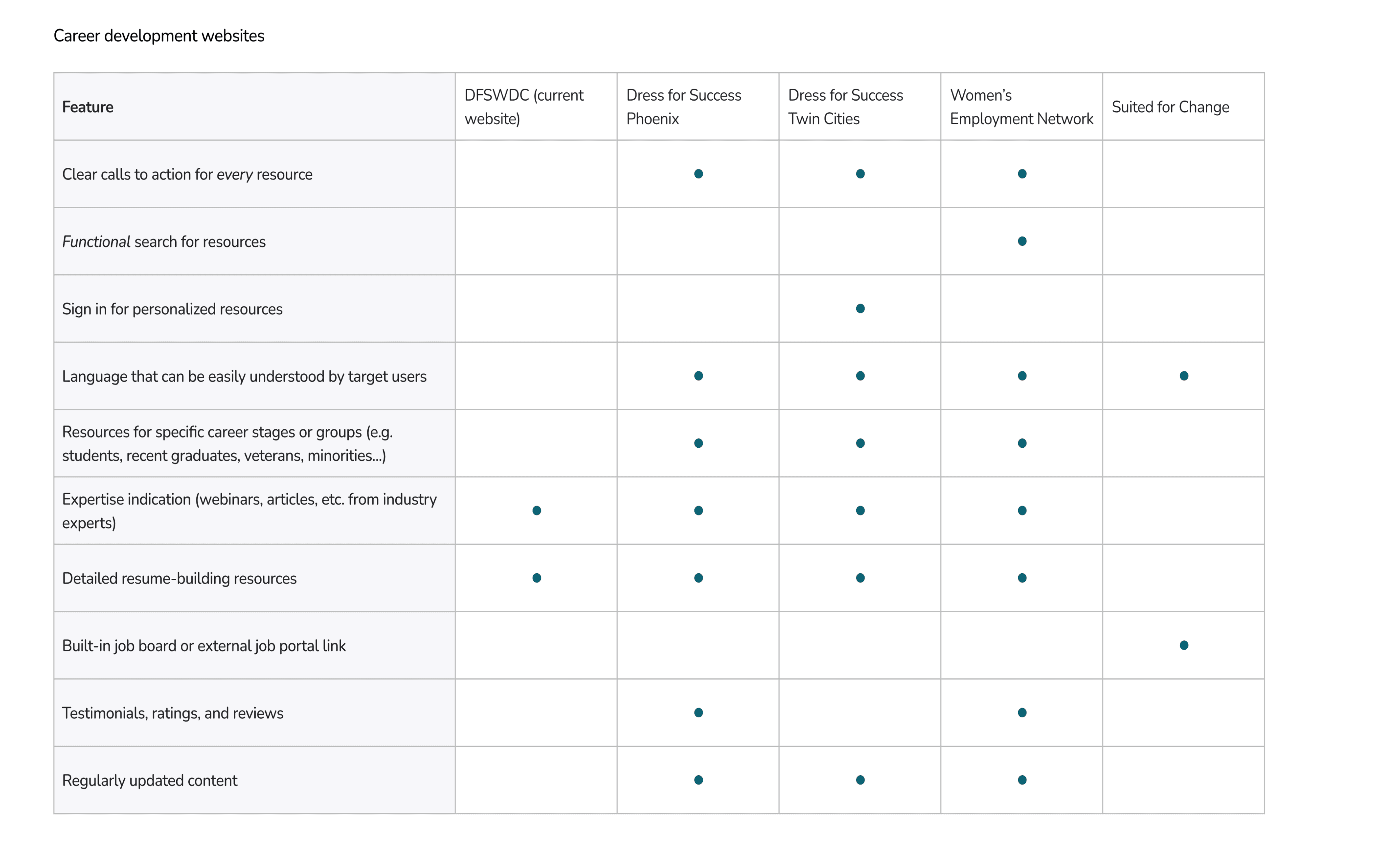
Comparative analysis of similar nonprofit websites and workforce-support platforms
3
User interviews and usability testing with DFSWDC clients
Across these methods, several consistent themes emerged:
Users relied heavily on scanning, not reading — yet content was long and unstructured.
Users wanted reassurance that they were in the right place and taking the right steps
Navigation labels were inconsistent and often unclear
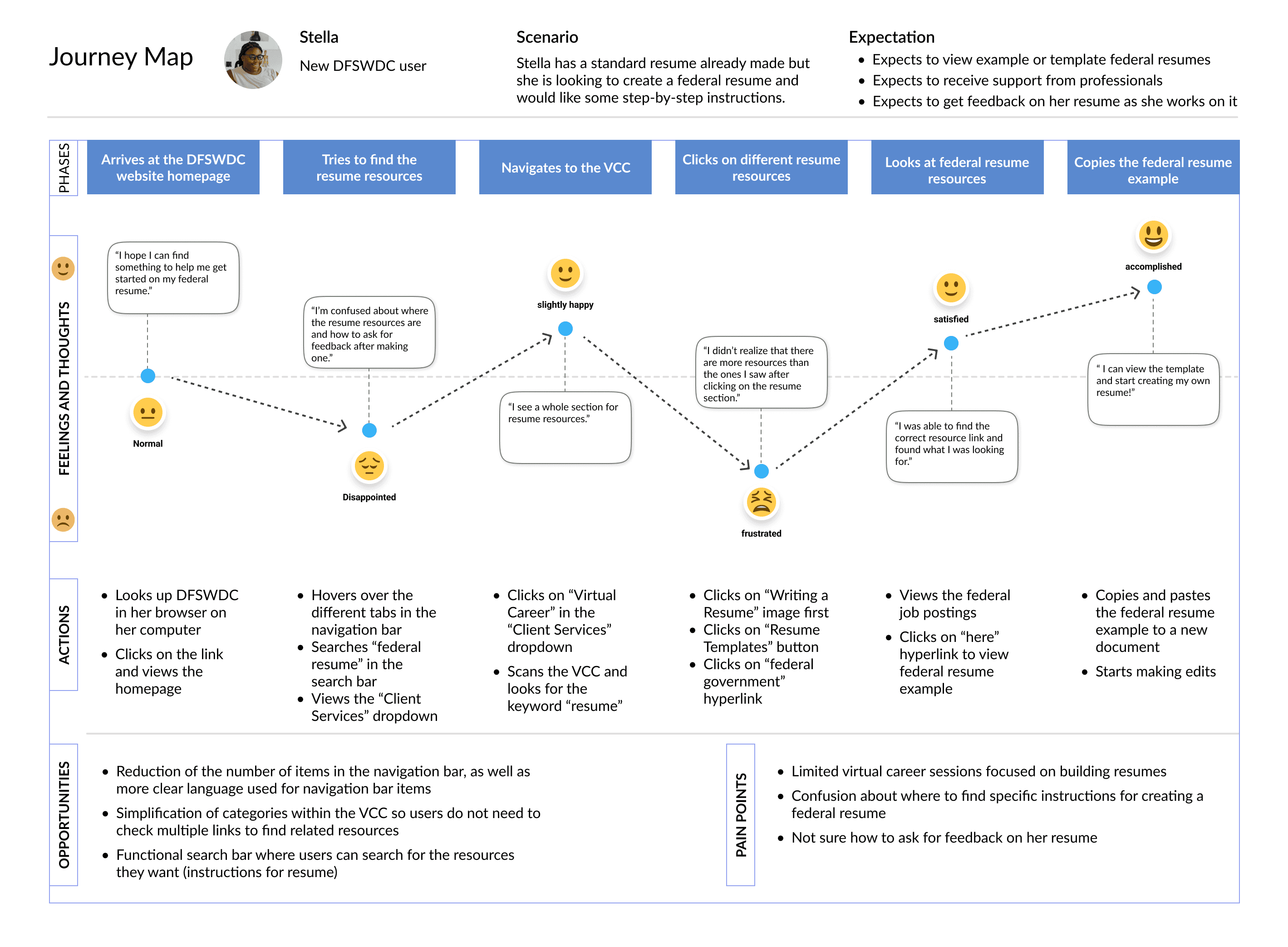
Mapping these insights into a user journey helped clarify where confusion, drop-off, and frustration occurred.
I used this research to define clear UX priorities:
Reduce cognitive load for first-time users
Make services and eligibility immediately understandable
Create predictable navigation and clear next steps
Design Decisions
1
Simplified and Re-Structured Navigation
Problem: Users struggled to understand where to start and how content was organized.
Decision: I restructured the information architecture to group content by user goals.
Why: Research showed users were task-oriented ("I need help finding a job") rather than program-oriented. Clear, goal-based navigation reduced decision fatigue and misclicks.

2
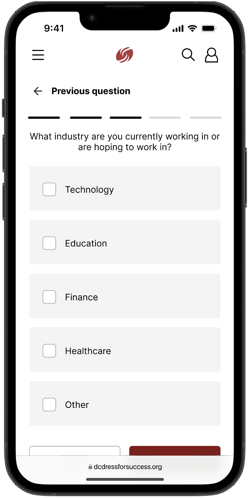
Clear Entry Points for First-Time Visitors
Problem: New users lacked confidence about eligibility and next steps.
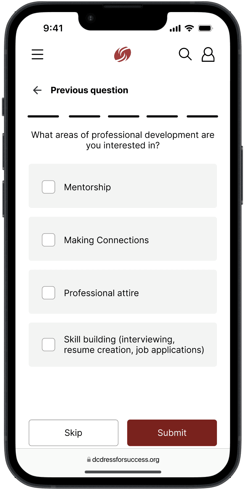
Decision: I introduced an onboarding questionnaire to personalize the user's content to their needs.
Why: Interviews revealed anxiety about "doing something wrong." Explicit guidance helped users feel supported rather than tested.


3
Scannable Content and Visual Hierarchy
Problem: Long text blocks made it difficult to quickly find relevant information.
Decision: I redesigned content layouts with stronger hierarchy, chunking, and whitespace.
Why: Usability testing showed users skimmed heavily; improving scannability directly increased comprehension and speed.

4
Iterative Testing to Validate Decisions
Each design iteration was tested with users to validate assumptions. Feedback directly informed refinements to navigation labels, page structure, and call-to-action placement before moving into high-fidelity designs.
Results & Impact
The final designs led to measurable improvements during usability testing:
100% task completion
for core flows such as finding services and understanding next steps
Preference for the redesign
citing clarity and ease of use when asked why
Increased certainty
about how to engage with DFSWDC services
Reduced hesitation
and confusion compared to earlier testing rounds
Increased confidence
when navigating the site on their own
For the organization, the redesign created a stronger foundation for scaling digital services and reduced reliance on staff to clarify basic website questions.
Reflection
This project reinforced that good UX is as much emotional as it is functional — especially in nonprofit and social-impact spaces.
Key takeaways:
Designing for vulnerable users requires prioritizing clarity, reassurance, and empathy
Research insights are only powerful when they clearly inform design decisions
Simpler solutions often have the greatest impact
If I were to revisit this project, I would involve stakeholders even earlier to align organizational goals with user needs sooner.
Overall, this case study strengthened my ability to translate research into actionable design decisions and to design experiences that support users during high-stress moments — a skill I continue to carry into my work today.